Branding for a group of schools who merged into one entity

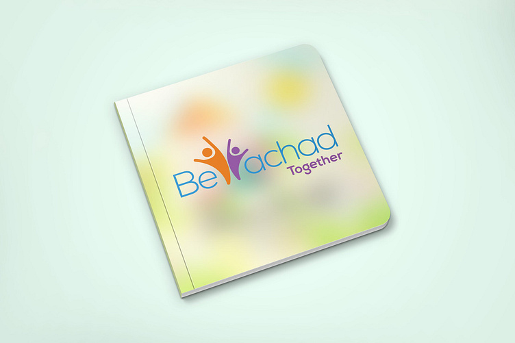
The client wanted a logo that combined two other entities. Using the Y, I created a memorable icon of joyous children. The icon signifies not only, happy children, but also the merging of two schools into one, with the children connecting the new program.