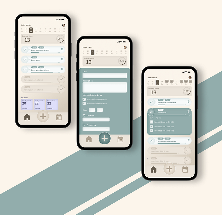
Checklist and to do app
Welcome in this small project.
This is taking part on the Product design course delivered by Dribble. Always interesting to imagine an app based on a daily issue.
First I drew on a paper several options I had in mind and then I created it in Figma.
When the task is done I prefer keep it available to consult it or provide a positive psychological impact on the user. To differentiate the finished task to the other one, I switch the color close to the one on the background and add a transparency layer.
I miss the overview of task I need to do. Sometimes, a task need to be done for a special day but a long preparation is needed to complete it (or at least to have time to do it). So I added the deadline tasks at the bottom to keep an eye or what I should do and when is the due date.
I chose a purple color to clearly differentiate the deadline to the daily tasks.
My navigation is simple: home with the daily tasks, add a task button and a calendar view.
I like the swipe to validate each task. It really increases the joy when you finish a task.
I am using smooth color to avoid any "emergency" effect and suggest calm and positive energy.
Next step together ?
If you want to connect, here is my linkedin.
Don't hesitate to let me know what you think. 🙏

