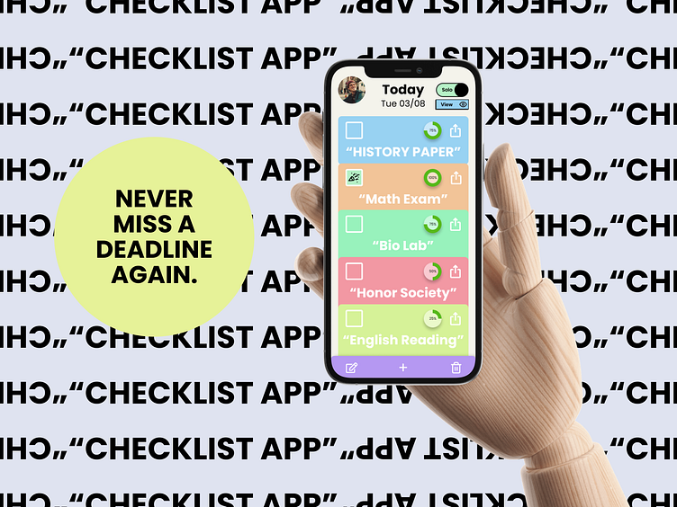
"Checklist App" Concept
Design Brief
Design the main screen of a checklist app. Consider how users add items to their list, check off completed items, or see recently completed ones.
Research
Before diving into my design, I felt it was essential to grasp the concept of checklists, their purposes, and the features that users prefer, dislike, or wish to have. Through extensive research, including articles and interviews with colleagues, it became evident that checklist apps are predominantly employed to increase productivity, stay organized, visually track deadlines, and delegate tasks effectively.
Upon investigating the current state of checklist apps in the market, I have noticed several pain points affecting users' experiences.
These pain points include:
Limited functionality
Users may be unable to edit their specific task or checklist, add notes, delegate tasks to others, or even change the color/picture.
Add / Remove Items
A confusing or cluttered interface makes it difficult for some users to add, edit, or remove tasks while using the app.
Reminder Notification
The app may not provide an option to be reminded/notified about future, past, or present tasks on their checklist.
Collaboration
Little to no collaboration options make it challenging to share your checklist with others, remind team members about a task, or even track team progress.
Interface
Users may need help navigating an unattractive or poorly organized app.
Weak Integration
Users may not be able to use/sync other tools and software to their current checklist.
No backup / restore button
An app may not have a save, backup, or restore button. Users may lose all their data in the event of a crash.
Goals
Design a clean and minimalist user interface that simplifies navigation, reduces user stress, aids in managing essential deadlines, and encourages seamless teamwork and cooperation.
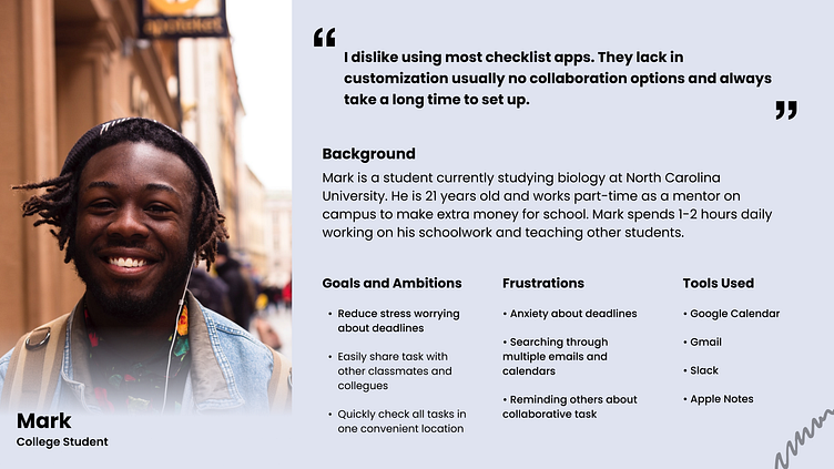
User Persona
I crafted a detailed user persona to ensure a user-centered approach throughout the design process, creating a vivid representation of the target audience. At each decision point, I consistently asked myself: "Will this design choice meet the needs and desires of someone like Mark?"
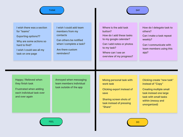
Empathy Map
I employed an empathy map to further connect with the user and refine my design approach. This technique allowed me to envisage and grasp the user's potential thoughts, speech, emotions, and actions while utilizing a checklist app.
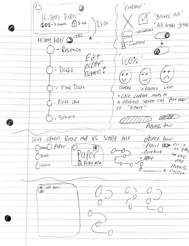
Ideas
To kickstart my design process, I conducted a brainstorming exercise to generate ideas tailored to satisfy users' needs, preferences, and pain points linked to checklist apps. By transforming these concepts into sketches, I gained valuable insights into the envisioned aesthetics and functionalities of the app.
Userflow
Before embarking on the design process, I mapped out the app's user flow. This approach enables me to customize the application to align with the user's preferences, resulting in a seamless and enjoyable user experience.
Wireframes
To create visually appealing designs, I incorporate wireframes into my process. Opting for grayscale wireframes with subtle color accents enables me to shape the design's visual identity and layout while staying clear of any early color distractions.
Visual Design
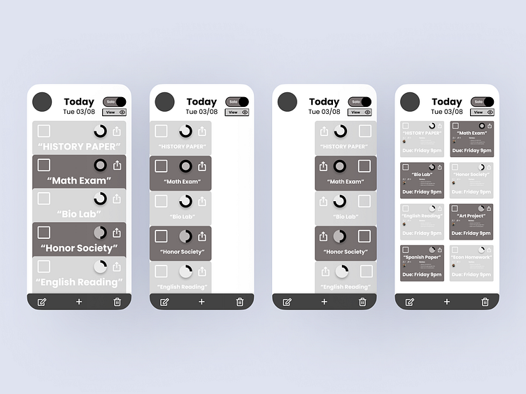
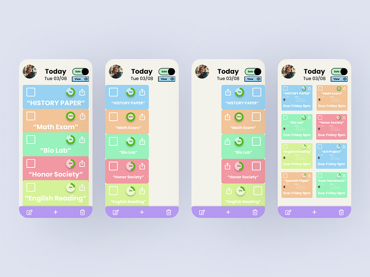
Following several sketches, I created multiple designs in Figma, each depicting different home screens that users can switch between within the app. Recognizing users' complaints about the lack of customization in checklist apps when viewing their tasks, I prioritized offering my users a variety of options. This way, they can select the format that best suits their preferences and needs.
Key Features
After conducting thorough research, I identified several key features I aimed to incorporate into my app. The main functionalities include adding and removing tasks, managing collaborators, and customizing tasks with options like changing colors, layout, and even attaching photos. Additionally, I focused on enabling users to export and share their checklists, integrate tasks with their local calendar, provide an undo option for mistaken removals, and introduce a "repetitive task" feature.
Prototype
To give life to my app, I integrated animations and interactions. These elements played a crucial role in offering a dynamic glimpse into the app's anticipated functionality upon completion.
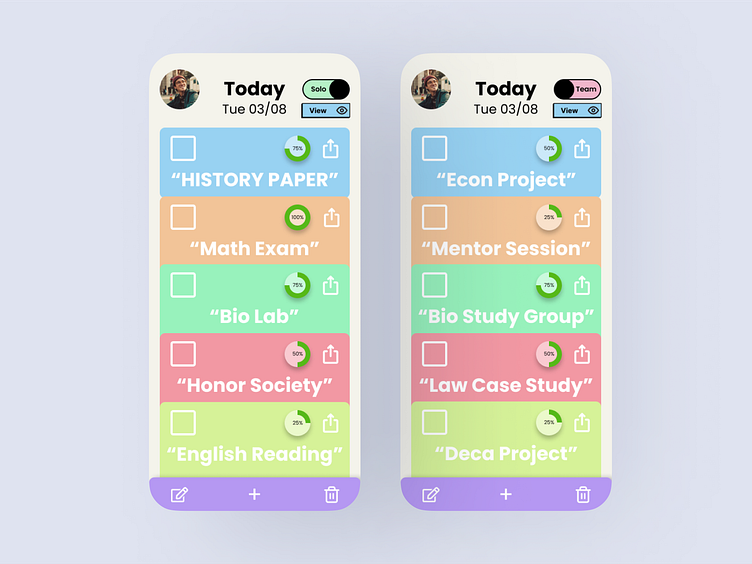
Switching From Solo to Team Tasks
Users can effortlessly switch between their solo and team tasks at any moment by utilizing the toggle switch in the upper right-hand corner.
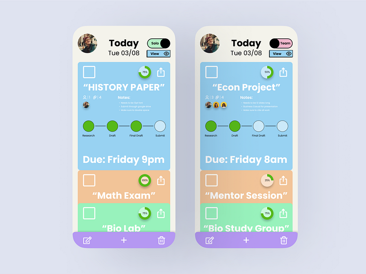
Viewing a Task
Reviewing a task is effortless and requires just one click. The task card opens by tapping the task of interest, displaying details such as the number of users involved, the task roadmap, notes, and the deadline. This approach aims to assist users in breaking down substantial tasks into smaller, manageable subtasks. The ultimate goal is to empower users to create personalized plans composed of smaller goals, helping them to achieve their objectives individually or collaboratively.
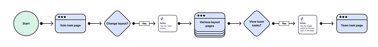
Changing the home screen
Effortlessly move between the app's diverse home screens by tapping the "View" button below the "Solo / Team" switch. This user-friendly action streamlines the navigation experience.
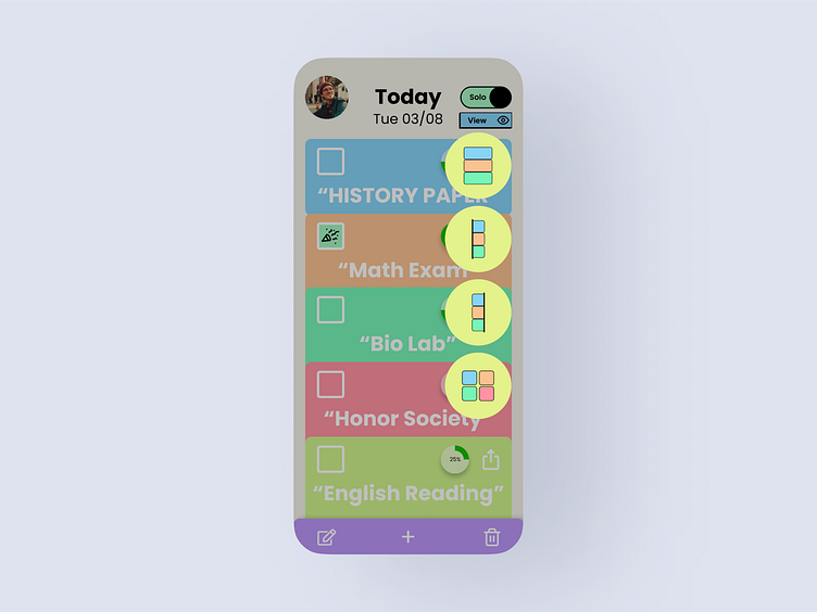
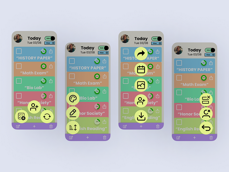
Buttons
To utilize the extensive range of features this app provides, users have two convenient options: select one of three buttons in the app's footer or click on the "export" icon within the task card itself.
Completing a task
My goal was to ensure that completing tasks on this app was both straightforward and enjoyable. After a user finishes a specific task, they can select the checkbox on the individual task card to trigger a delightful completion animation.
Components
I developed a set of reusable components to streamline my design process, interactions, and animations. These components allow me to edit, add, or remove items efficiently, providing simplicity and consistency throughout the design.

Conclusion
During my research, I discovered that many individuals find writing down their tasks beneficial, aiding them in recalling deadlines and pending activities. However, several users expressed dissatisfaction with existing checklists applications due to the lack of integration, customization, and collaborative capabilities.
My application addresses these concerns by allowing users to effortlessly create individual and team tasks. This inclusive platform enables users to view, edit, export, synchronize, and share their checklists with others, simplifying task management in one convenient location.
Throughout the development process, I thoroughly enjoyed creating this app and immersing myself in extensive research. Understanding the user's needs and challenges was a fun journey that guided me in crafting solutions to the user's biggest problems.
Thank you for taking the time to explore my checklist app. I am excited to present a tool to enhance productivity and collaboration for all its users.
