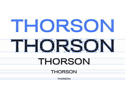
Thorson
Two weeks ago, we drew a logo for Amanda Thorson, a photographer in Australia. In reviewing reference material, there was a lot of Helvetica. 😏
We can appreciate the classic nature of Helvetica, but for a logo, we wanted something a little more distinctive, so we drew a custom logotype, based on the metrics of Helvetica Extended, but with a little more personality. The characters flare out, there's a little more variety in the stroke width.
But what I really want to talk about is designing type as an icon designer.
I've been drawing icons for just about ten years now. Type, though it always sneaks in to my workflow somehow, is not my strongest suit. But over time I've been developing skills to draw shapes better through icons. And so I find myself an icon designer occasionally drawing type.
Real typographers are often focused on perfect balance of characters, the interplay between them, and nudging things not by increments of pixels, but by how it feels.
When I draw type—and I should be clear that this isn't a better approach—I draw things on grids, strictly. I think all designers can appreciate drawing things on grids, but I draw them strictly on pixel grids, sometimes at the expense of things feeling exactly right, just so it can be sharp at certain sizes.
I grew up making icons at 16, 32, 128, and 512 pixels square. Since they're all multiples, if you draw art on a grid, you can save time, and ultimately win some clarity when you make all the individual sizes.
I take a similar approach when drawing type, and the results allow me to scale type without hinting.
Though I'm sure some true typographers and type designers would laugh at me, I find my approach manageable, and practical. Most things I design are never for print, and so will (at least for a while) not have the luxury of infinite resolution.
Hire Parakeet for your project!

