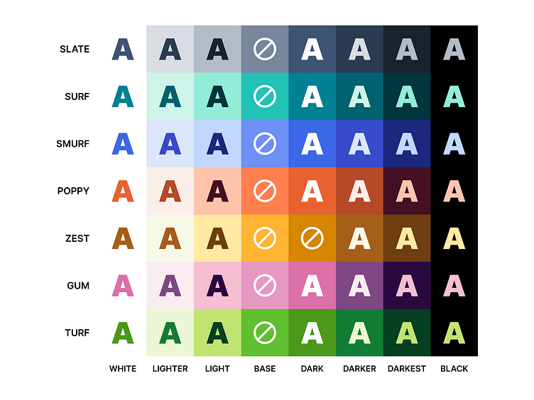
Was inspired by the recent Wise rebrand to create a color palette that balances accessibility and aesthetics (something I've long struggled to do). Obviously still some weak points in the yellow spectrum, but overall I'm happy with how bold and vibrant this is while remaining accessible.