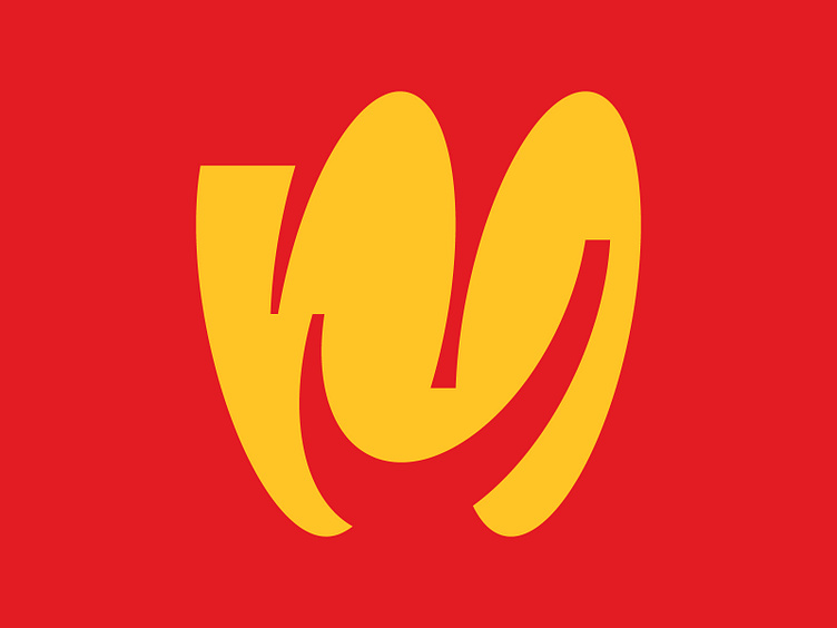
Letter M - Logo design, lettering, icon, smile
Still the same as the previous post, a letter M. And even I still use a shape that is almost the same as the previous concept, but this one has many modifications and improvements from the previous concept. And it seems that I am reminded of the Mcd logo 😅 after trying to use red and yellow colors.
More by Satriyo Atmojo View profile
Like
