Identity concept for soap-shop
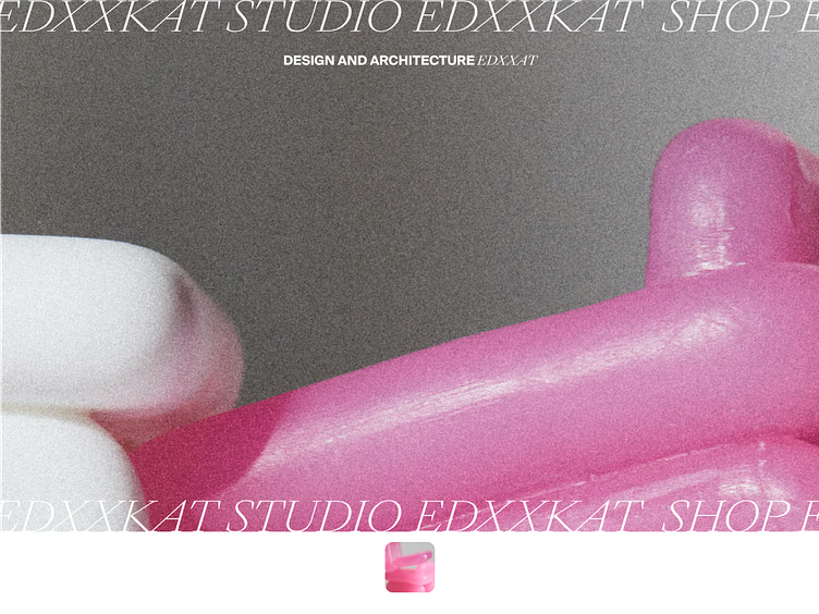
I used accident typography with hard contrast, warm atmosphere of film photography and soft lines, the smooth texture of the soap and the smooth rounding of the cards in combination with the sharp corners of the font — all of this are the specific nature of the brand identity.
