bepo - a marketing website for a web agency
Hi fellow Dribble adict ! 👋
Welcome in this case study where I will explain you all my journey on this web agency website.
Project overview (TL;DR)
I know you might not have much time so here a small summary if you're in a hurry.
Design brief
bepo is a french web agency created in 2021 by Axel Vaindal (here his Linkedin and Twitter accounts, he is speaking english mainly).
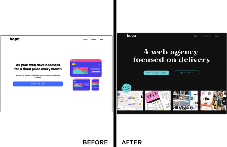
He came to me after his first launch with this website. It was an MVP so he didn't invest a lot of time and money in it. But as growing, he absolutely needed a better design to illustrate his expertise.
His target customer is a non-tech founder who need expertise and advices to develop website and webapps in french and/or english.
He wanted to let them feel safe, well supported and relieved regarding his dev and product expertise.
Work and result
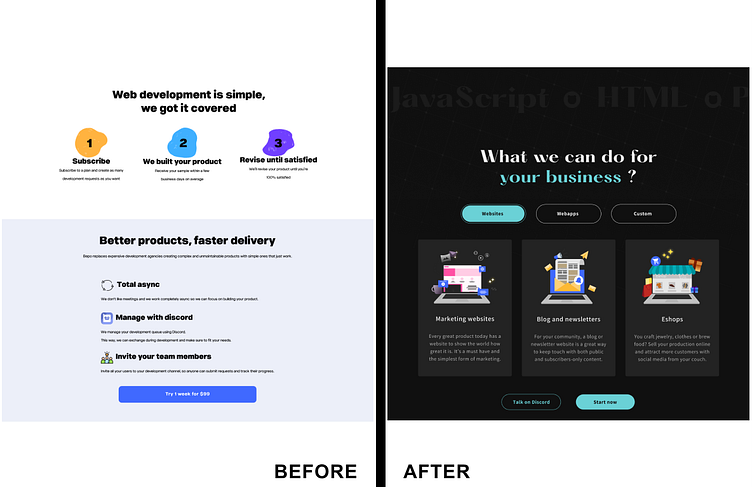
In this project, we work for several months to improve the website and give a proper brand image thanks to illustration, animation and a responsive design.
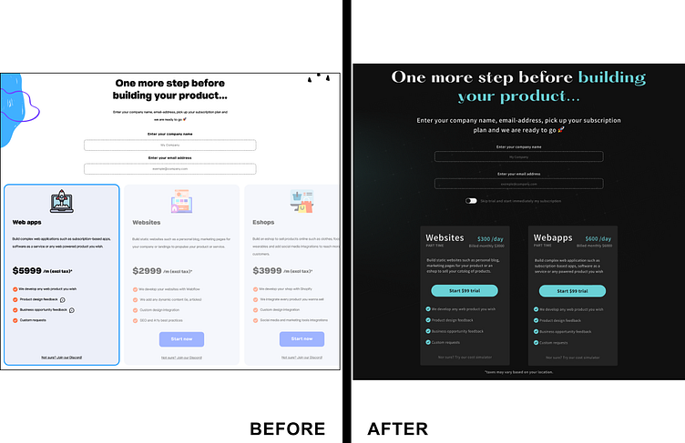
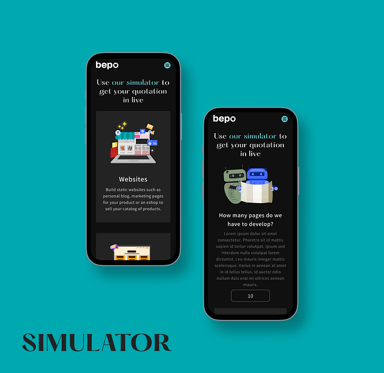
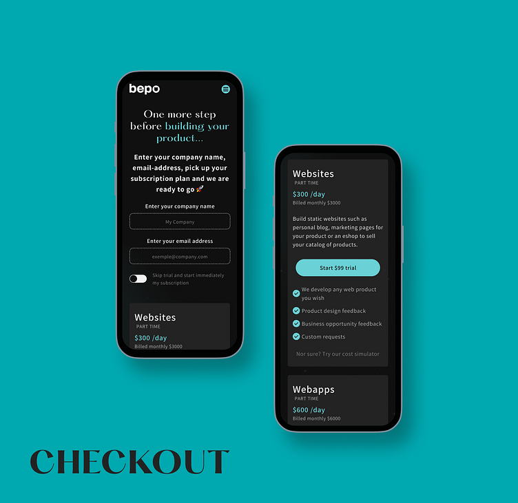
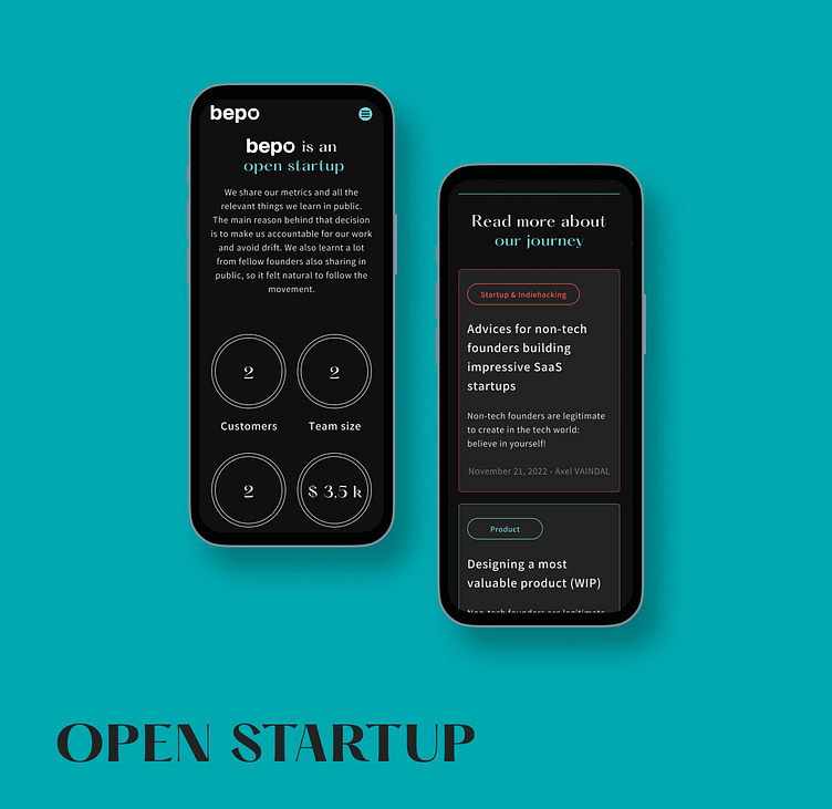
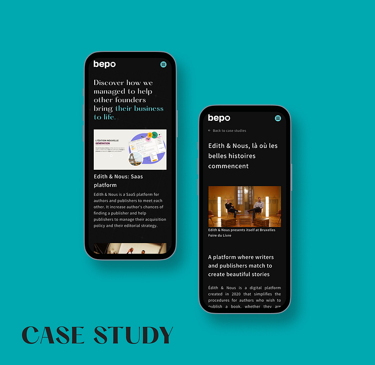
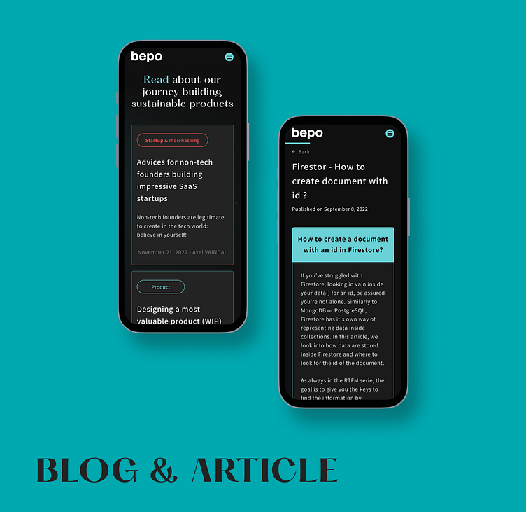
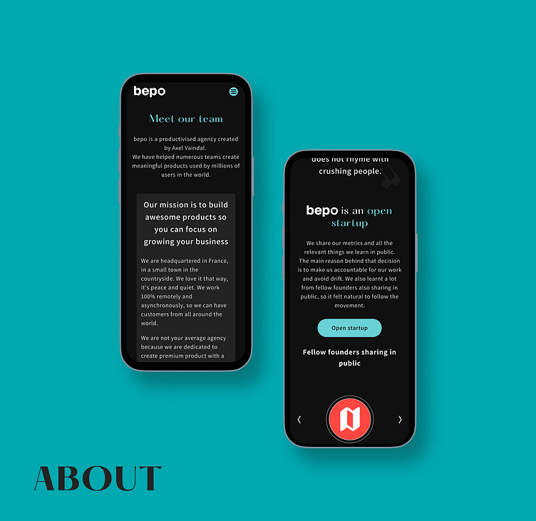
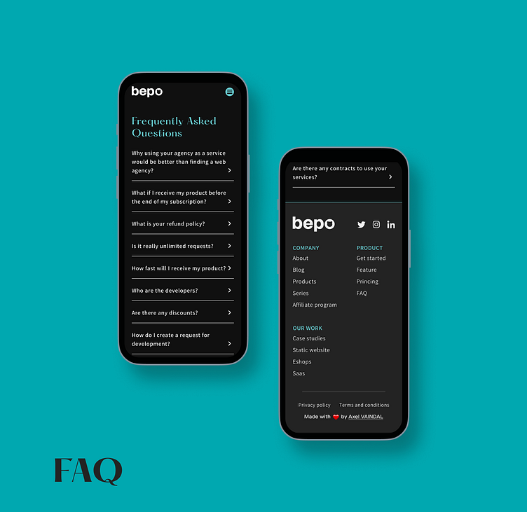
I delivered the entire website (desktop and phone verrsion) which contain the following pages: home, blog & articles, about, FAQ, checkout, case studies, cost simulator, open startup and the legal pages.
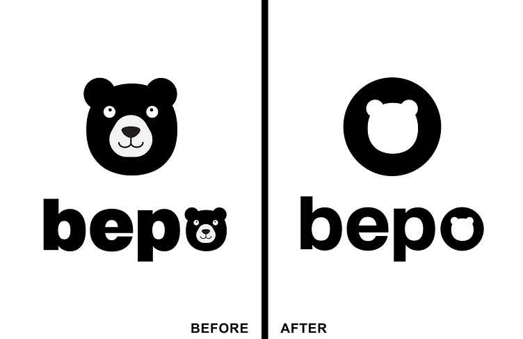
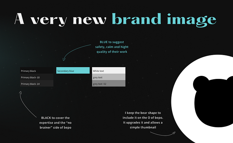
The first logo has been updated too to match with the brand image he wanted to bear.
After design process, he decided not implementing animation for now because it wasn't his first priority. He couldn't spend to much time on it.
You can take a look below with the before/after design and don't hesitate to let me know what you think in comment. ❤️
My Role: UI/UX Design
Time: 3 months
Mission: Released ASAP - latest 2022 quarter (bepo website)
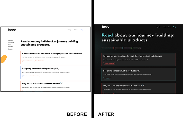
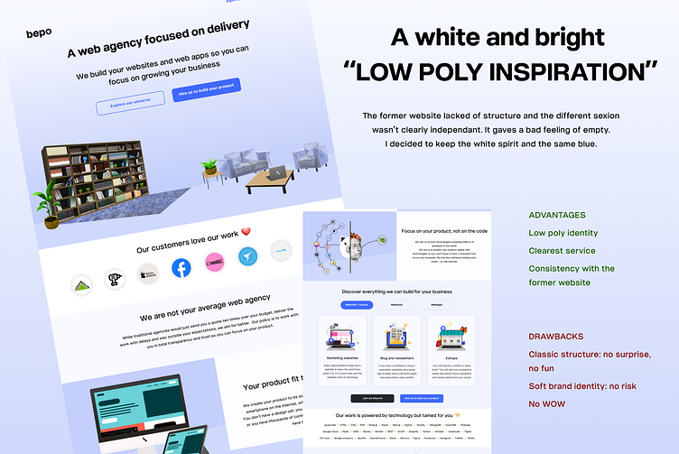
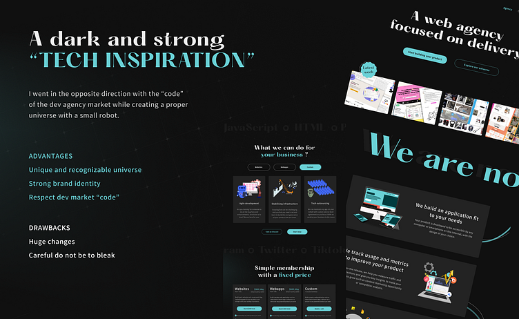
Chose the brand image
First thing first, I wanted to be sure if Axel expected a big update or not. So I worked on 2 opposite proposals. This helped me to help him to have a better idea of the new website.
He told me he couldn't work with moodboard and expected a designed page to have an opinion. So I might spend a lot of time at first to propose those directions but it was worth it as he choose one for the rest of the website.
Lock and website pages design
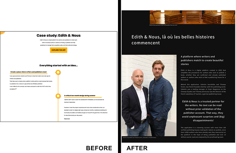
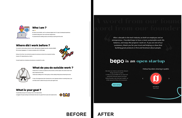
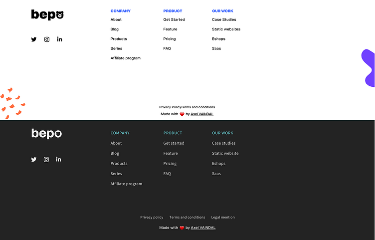
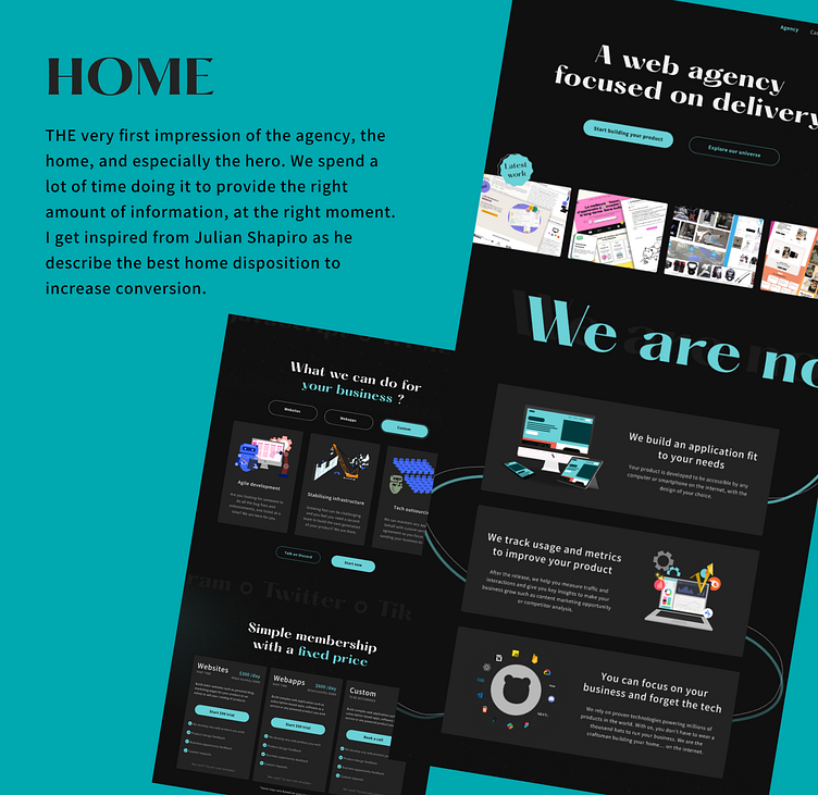
After we found our brand image and artistique direction, I naturally declined all pages.
Axel worked a lot on the contents so he gave me all section we wanted in each pages. We didn't have to do proper wireframe per se. Unfortunately, I couldn't do it anyway for this case study, you will only have the final result. Anyway the parts are quite clearly defined and separated.
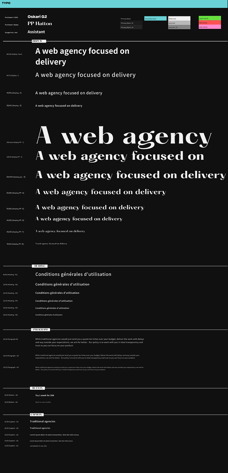
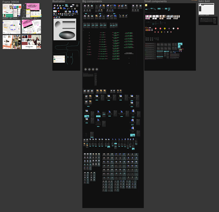
While creating the different pages, I built the design system in the same time as we could save time and duplicate easily on phone frames.
I adjust a little the design when I had the final copywritting. I created a special file where Axel could write directly on the frame as he could see in live the final result. He had the global amount of text to "respect" to stay the closest possible to the original design.


Responsive design
After we froze and confirm the desktop pages, I did the same for the phone frames as a part of the initial request.
Usually I am using a medium size for the frame, as the Iphone 13 to cover a good part of the phone sizes.
In this particular case, as we wanted to be sure it was working "perfectly" on the smaller phone, I took the Iphone SE.
I had to resize everything and the particular small screen added a challenge, especially for the hero. We wanted to be sure the main informations were available without scroll for the hero part on each page.
We finally make it, I let you discover it 😄.
UI library
I was creating it while I was building the desktop version which was time saver when I came to the phone frames.
I trying to keep it simple to focus on the message itself. No need extra fancy decoration as the main subject here was simplicity, trust and expertise.
Implementation in real
It's always a pleasure and a pride to see my design come to life.
The project backer, Axel, created the website on desktop and phone directly from my figma file. We had to do a couples compromise as he couldn't spend to much time implementing this website.
For instance, the feature and hero animations wasn't implemented because it wasn't necessary for him to deliver his message about his service.
It's life and someday the animation will come to life. Waiting for this moment you have them in this case study 😉.
If you want to see in live the final result, here is the link : https://www.bepohq.com/
Final result
I enjoyed upgraded this website and work with this wonderful person such as Axel Vaindal. I highly recommend his expertise if you need any dev or product advice support 😉.
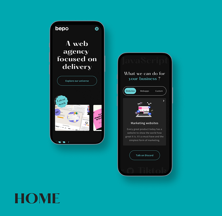
Below main interaction on the home page.
Next step together?
Summary
With this complete project, I worked in live and direct with devs and have a better understanding of their needs and issues when they receive a figma file or any other design.
Contact
If you are interested about my work, I will post and update the new projects I used to work on and the ones I'm currently doing.
It's so diversified and interesting
author/publisher relationship online platform
fun and playful administration doc app
... and many others
If you want to work with me, don't hesitate to contact me on LinkedIn.
Nota Bene : I created all illustrations.
