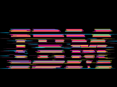
Glitch Lettering
I took a few hours a few months back to play around with the idea of "glitch" which was the initial intended theme for a SXSW party. I used Paul Rand (he's probably going to spite me from the heavens for this...) original 8-bar logo and CMYK as the color palette to create this glitch lettering. The initial intent of this graphic was to be included on a t-shirt as a give-away piece.
I wasn't asked to do this, nor was it commissioned from me. It was more a test in looking at how to reproduce the glitch effect while maintaining the overall feel of the 8-bar graphic. Until now only a few people have seen this via my files on my machine and was never used for anything.
More by Cameron Sandage View profile
Like

