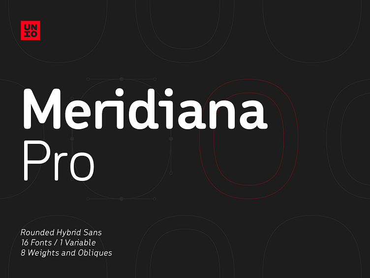
Meridiana Pro
The concept behind Meridiana Pro was to create an amalgamation between a rounded sans and a monospaced font in order to obtain an extensive and usable variable type-system.
This typeface encapsulates a symmetrical and balanced rhythm due to the unique blend of different sources of inspiration. Proportions are precisely adjusted with smooth contours and subtle contrasts. These forms give the font an eye-catching look without compromising elegance and minimalism, ensuring that each glyph will work well in any graphic design purpose.
The focus was to create a versatile type family with range of alternates, ligatures, and symbols, including the extensive language support of most European languages.
Meridiana Pro design space includes two axes, weight and italic and is available as a variable font or as a separate OpenType family, including weights from Thin to Heavy plus their obliques.
Freebie: https://tinyurl.com/meridianafreebie
Premium: https://tinyurl.com/meridianapro
Thank for viewing, Unio.
