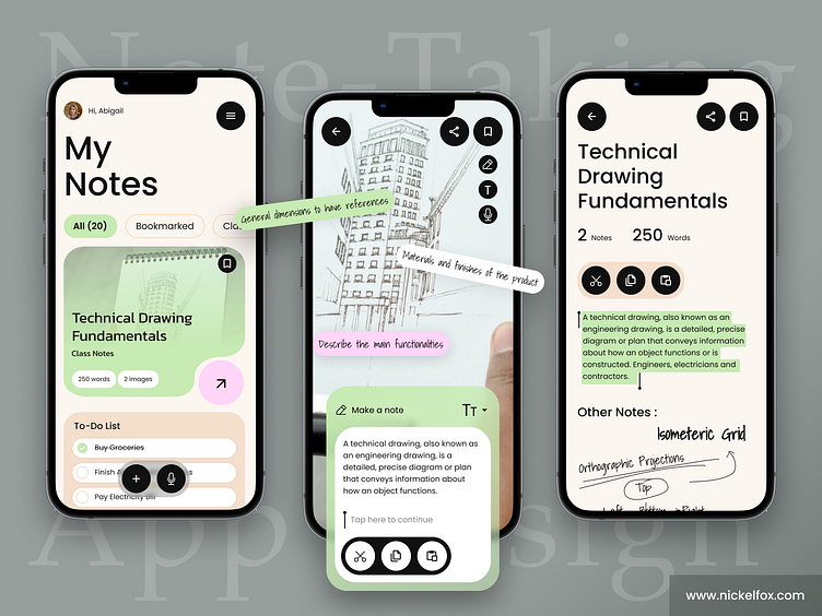
Note-Taking Mobile iOS App
Hello Dribbblers! 👋
This note-taking app design concept is focused on creating a simple, intuitive, and efficient user experience that helps users easily capture, organize, and access their notes. 📝
A note-taking app is a digital tool designed to help users capture and organize their thoughts, ideas, and information in a quick and convenient manner. This app provides a simple interface for users to create and store notes, as well as various features to help them customize and manage their notes.
--------------------------------------------------------------
For Freebie Click Here
--------------------------------------------------------------
Have an idea? Let's talk here or WhatsApp
Follow us here:
The note-taking app design concept is focused on simplicity, functionality, and ease of use. The app's interface is clean and uncluttered, with a minimalist design that allows users to focus on their notes and ideas. ✍️
The app's color scheme is soft and calming, featuring shades of pink, green, and white. These colors create a warm and inviting atmosphere that encourages users to relax and express themselves freely.
Colors
🎨Tea Green (# C7EBB3) - Tea Green is a warm, earthy green color that is often associated with nature, growth, and tranquility. Used as the primary color, it is a perfect choice for a note-taking app, as it can help create a calming and inspiring environment for users to capture and organize their thoughts and ideas.
🎨Smokey Black (#111111) - Used as primary color for text, pure black pagainst pure white can cause eye strain, hence a dark grey is used.
🎨Champagne Pink (# F4DFCD) - used as an accent color, it represents creativity, inspiration, and imagination. It can inspire users to tap into their creative side and express their thoughts and ideas in a meaningful way.
🎨Pink Lace (# FFD5F8) - Used as an accent color, in a note taking app it represents emotional expression, sensitivity, and compassion.
🎨White (#FFFFFF) - White helps create spaciousness and clarity, making it easier for users to focus on their notes and thoughts.
Font
Poppins - Geometric sans serif typefaces have been a popular design tool ever since these actors took to the world’s stage. Each letterform is nearly monolinear, with optical corrections applied to stroke joints where necessary to maintain an even typographic color.
Shadows Into Light - Shadows Into Light is a hand-drawn, cursive font that has a unique and personal touch. The font's hand-drawn style can create a sense of warmth and friendliness, making users feel more connected to their notes and ideas. It can also convey a sense of informality and creativity, allowing users to express themselves in a more personal and unique way.
Press 💖if you like our design and share feedback!


