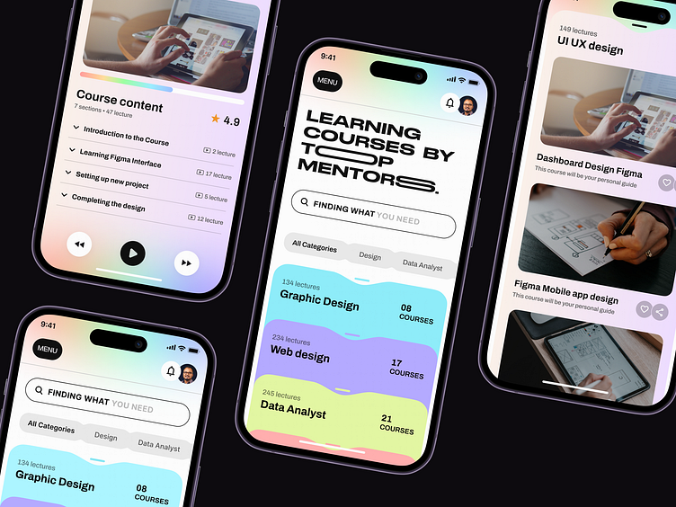
Personal Online Education App
Hello Dribblers!
Virtual learning can be effective and enjoyable when the platform is intuitively designed, just like our Personal Online Education App design!
This app design is aimed to be intuitive that helps easy navigation. At the same time, we made sure it was consistent, user-friendly, and with an intuitive visual hierarchy.
We made sure the design looks simple and stylish. So, this thought inspired us to use pastel color palettes and contrastingly bold typography over a white background, which will help readers to engage better.
The features like easy search, adding new courses, and keeping track of ongoing courses will give the learners control over the app.
What do you think? Don’t forget to share your thoughts!
We appreciate your interest, Dribbblers! 😍
Schedule a call at ☎️ 👉🏼 Calendly.com
Let's talk about your project..
✉️ hello@musemind.agency
Website 🌐 musemind.agency
Explore Our Design Case Study Featuring ➡️ Behance
Let's Check Our Others Dribbble Profile:
musemind saas • musemind mobile • musemind branding
Follow us to see more exciting shots and insights on:
Linkedin I Instagram I Twitter I Medium I Facebook I Webflow


