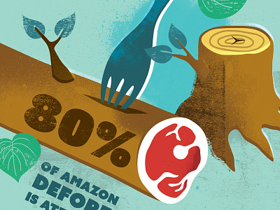
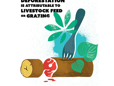
Flexitarian Bristol – v02 (detail)
Made some changes to this illustration following first-round discussions with the client. They liked the idea and style of the first version, but felt the tree needed feel more like it had been felled, to reflect deforestation and the environment. We agreed to include the tree stump, and, to make the tree look more like it had been recently felled, I positioned it coming off the page and added a few leafy branches. We also felt the black text in the first version was too heavy, so in this version it is better integrated with the image. The coloured background feels less stark too.
More by Michelle Barker View profile
Like

