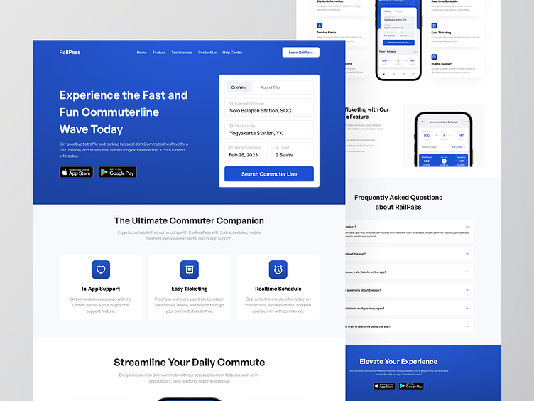
Railpass - Commuter Line Landing Page
Greetings, earthlings! 👋
Welcome to take a deeper glance at my next concept of Railpass website design. Wanna see what I crafted?
Move your finger down to view more! Cheers! 🤙
Overview
RailPass is an online mobile application to provides the latest or real-time with information about subway train schedules, routes, and other relevant information. Providing a mobile app for subway trains can improve customer satisfaction by making the subway system more accessible and easier to use also the subway system can respond more quickly to changing conditions and minimize delays.
With such many details in one screen, I tried to make the information more compact in the right place. So I’d like to prioritize the most important information and display it prominently. I use design elements like size, color, and placement to draw attention to the most important information.
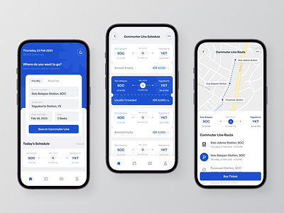
Providing users with only a list of available schedules that can help them make an informed decision about when they want to travel and which train they want to take. This information can also help users plan their travel itinerary more effectively. Implemented clear headings and labels to make it easy for users to understand what information is being presented.
In addition, providing users with a visual representation of the train route such as the location of train stations, major landmarks or attractions along the route, and estimated travel times. Consider using clear labels, icons, and colors to make it easy for users to understand the information presented.
Interest in partnering with us? Say hello at hellodama@odama.io or visit our website odama.io
Check us more at:
📷 Instagram | 🛒 Gumroad | 🎉 Figma Community | 🛍 Creative Market


