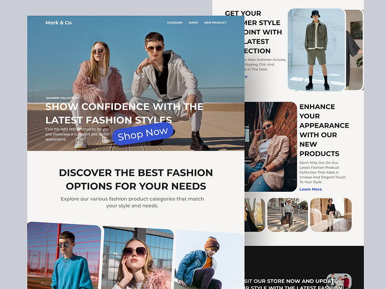
Mark & Co. - Landing Page Website
Hello Flexi Friends👋🏻
Mark & Co's website design showcases a sleek and modern look, with a simple yet elegant layout that draws the user's attention to the brand's high-quality products. The website's homepage features a prominent banner that highlights the latest collections, followed by a grid of product categories that allows users to easily navigate and find what they are looking for. The website's color scheme consists of a combination of black, white, and gold, creating a sophisticated and luxurious feel that is in line with the brand's image.
The product pages are designed with a clean and minimalist approach, displaying high-quality images of each item, along with detailed descriptions and sizing information. The checkout process is user-friendly and straightforward, with clear steps and easy-to-follow instructions. Overall, the design of Mark & Co's website successfully represents the brand's image and values, creating a seamless shopping experience for its customers.
Scroll down to see more 👇🏻
Other Views👓
Full Page
Show your love for my work by hitting the "L" button, and don't hesitate to give feedback for improvement. Enjoy your experience and thank you for your support!😁
----------------------------------------------------------------------------------------------------
Thanks for your attention😊
----------------------------------------------------------------------------------------------------
Let's collaborate to achieve our shared goals
📩 hello.flexboxstudio@gmail.com
----------------------------------------------------------------------------------------------------
Follow us


