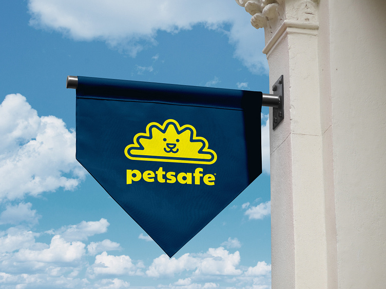
PetSafe Logo Concept
It's been a minute since I've posted anything so I decided it's time to share some of what I've been up to. First up we've got a logo I created for one of the brands I work with at Radio Systems.
Last fall I had the opportunity to create some logos for a rebrand of PetSafe. I only had a couple of days during my 2nd round of designs when this idea emerged so I didn’t have time to polish it as much as I would’ve liked to but it was easily my favorite because of how fun it is and I saw it as an evolution of one of our prior logos. When I first created this logo I really liked the contrast between the typeface and the mark but if I had more time I would definitely have rounded the typeface or looked for a similar one with round terminals to create a more harmonious lockup.
Ultimately this concept didn’t suit the direction PetSafe is going in but I was extremely pleased with what I was able to come up with in such a short amount of time and it was a fun little break from designing app screens.
