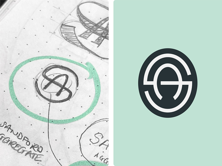
Sandford Aggregate logo design
Sandford Aggregate is a UK based aggregate and building material provider. The brief made it clear not to fall into the construction design stereotypes of super blocky type and aggressive angles and so I treated Sandford Aggregate as a more modern building material provider.
For this project, I wanted to create an elegant but hardwearing S + A monogram. I sketched out a few options and settled on this oval shape with the S cutting through the crossbar of the A. Pairing this with some equally gritty yet professional type brought this brand to life especially once I decided on this light mint and dark teal colour palette which helps them stand out from the competition.
Interested in creating or refreshing your brand's identity?
More on www.chitt.co
More by Jack Chitty (Chittco) View profile
Like


