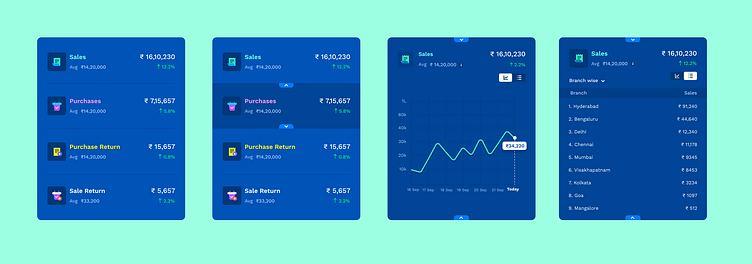
Card interaction
There was lot of data and KPIs which couldn't fit the layout and needs to be there on the screen. Had to go for this reveal/shut approach where user can still find the data but not on top and had to drill one level. I found it useful as this is not an often used function to the user. And the use case didn't demand this data to be shown upfront but wanted this to be present on the screen.
More by Ayyappa Sirigiri View profile
Like
