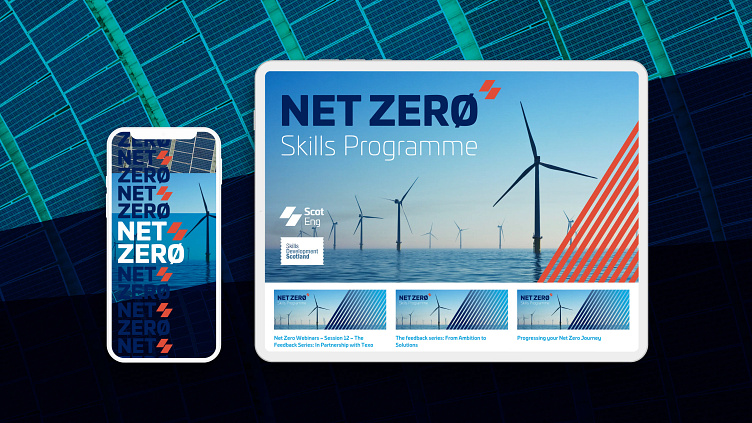
Logo, animation and social graphics for Net Zero brand
Logo and graphics to promote Scottish Engineering's Net Zero programme. The logo ties in with the overall ScotEng brand using the main brand's icon and main colours.
We used the Ø instead of the uppercase O to ephasise the zero-ness of the logo. The Ø alongside the orange ScotEng icon then became the icon for the programme.
More by Weiter Studio View profile
Like


