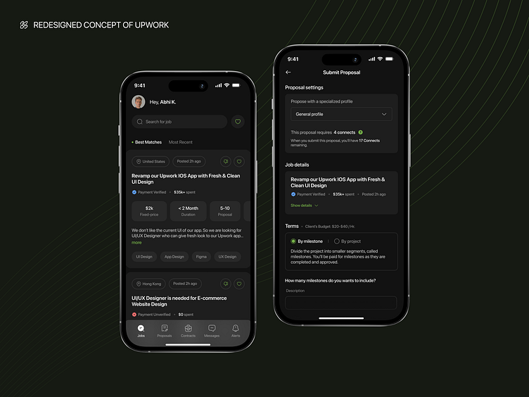
Redesigned Concept of Upwork App
📄 Introduction of Project
Upwork is an online marketplace that connects businesses and freelancers from around the world. Upwork provides a platform for businesses to find talented professionals for various projects, including web and app development, design, writing, marketing, and more. Here, I tried to improve the UI of current upwork app.
😞 Problem Statement
The current Upwork app is definitely a user friendly but i thought it could be even more better. btw, I came to know that there's no dark mode theme available for the app which i found little weird.
💡 Solution
The redesigned UI and addition of a dark theme for the Upwork iOS app will significantly improve the user experience. The new UI design will address the inconsistencies in layout, typography, and color scheme, providing a more streamlined and visually pleasing interface. Additionally, the dark theme will enhance usability in low-light environments and reduce eye strain for users who prefer it. Overall, My redesigned UI and dark theme concept will provide a more engaging and efficient experience for Upwork's clients and freelancers.
Hello Folks,
Check out my redesigned UI for the Jobs & Proposal screens of the Upwork app! Say goodbye to cluttered screens and hello to a streamlined, user-friendly interface. With a fresh color scheme and intuitive navigation, finding and applying for the perfect job has never been easier. From the proposal process to job listings, my redesign simplifies every step. Don't just take my word for it, take a look at my Dribble shot and see for yourself!
Express your support by pressing 'L' ❤️ & Feel free to share your thoughts. 🙌🏻
I'm available for projects.
Let's talk, hit me up through email at abhibusiness41@gmail.com
Keep in touch with me here 👉🏻 Instagram


