Norm Identity Guideline
Hello there!
I partnered with Earthr for Norm Health's brand identity earlier this month.
Here is a sneak peek of the guideline.
Norm Health Brand Identity
Deliverables
Logo, Color Palette, Typography, App Icon, Brand Guideline
Duration
3 weeks
Context
Norm Health prioritizes long-term health and provides preventive healthcare. We help you make small changes in all aspects of your life for fast results and long-term benefits, so you can live longer and healthier without sacrificing your daily routine.
They cater to male and female individuals aged 35 and above who are based in the city and have executive-level jobs that require prioritizing their health. We understand that this demographic faces unique challenges and our goal is to provide them with the tools and support they need to maintain their health in the face of these challenges.
Progress
During the kickoff call, the client provided detailed documentation outlining their expectations, values, desires, competitors, and overall identity. Although some sections were placeholders, the extensive PDF helped accelerate and guide the design progress. Throughout the design process, we actively involved stakeholders to ensure alignment with their goals and objectives.
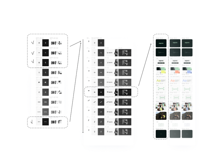
We worked through four rounds with the client, helping them understand their visual direction and effectively reach their target audience. In the initial stage, we presented potential logos, typography, and social templates in black and white. The client then selected options they wanted to explore further, which we turned into a concept and iterated on.
Once the concept was finalized, we explored various color studies, one last alignment call and gathered all the work in a single source: Brand identity guideline.
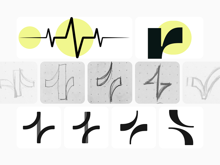
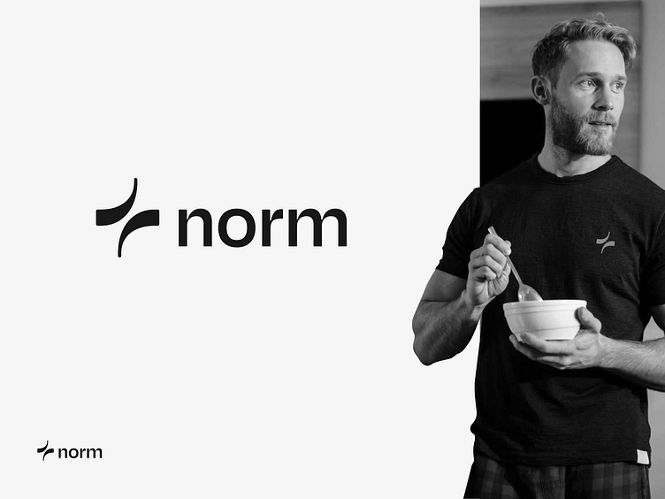
Identity Story
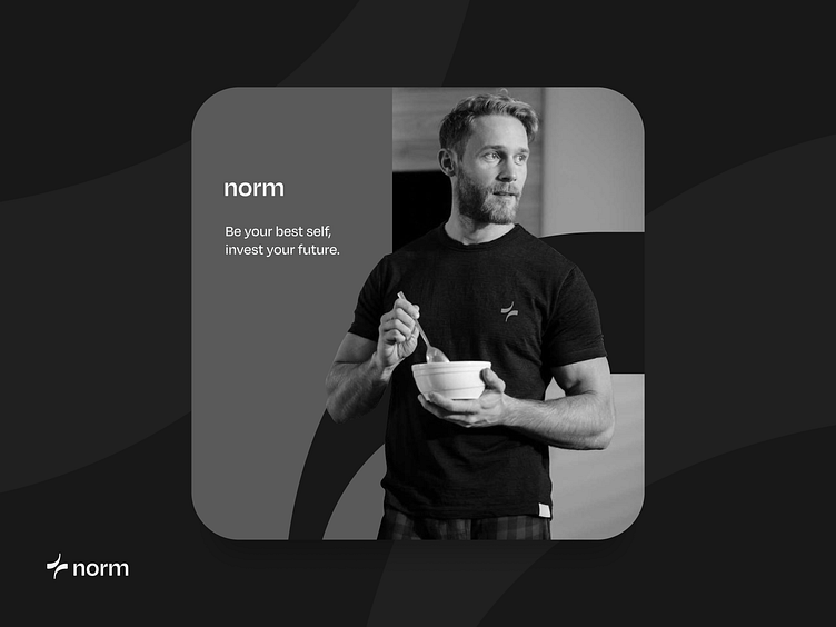
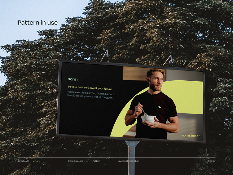
Norm's identity was inspired by the heartbeat, rhythm, and vitality that exists beyond daily routines. We translated these core values into visual elements that resonate with Norm's users. We created distinctive, standalone graphics that embody the brand's identity and narrative to meet the client's expectations for an image and copy-heavy identity that is easy to switch and communicate through pre-made templates. Our goal was to give Norm a mature yet dynamic identity.
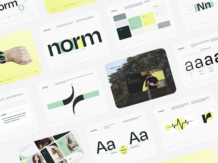
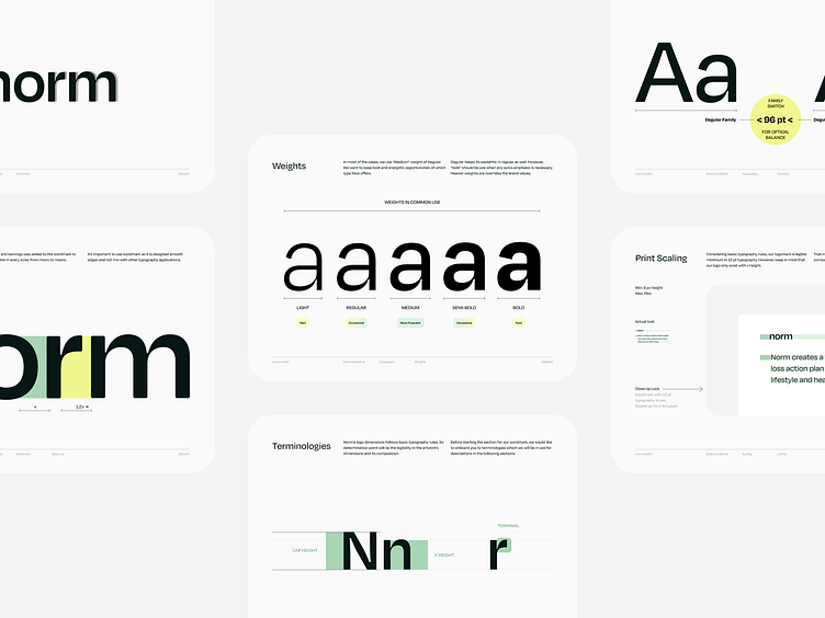
Typography
Given the company's mature image and target audience, we considered various typography choices, including Degular. After careful consideration, we chose Degular for its geometric form, elegant edges, bold contrasts, and fine details, all of which reflect Norm's brand identity in the most effective way.
Colors
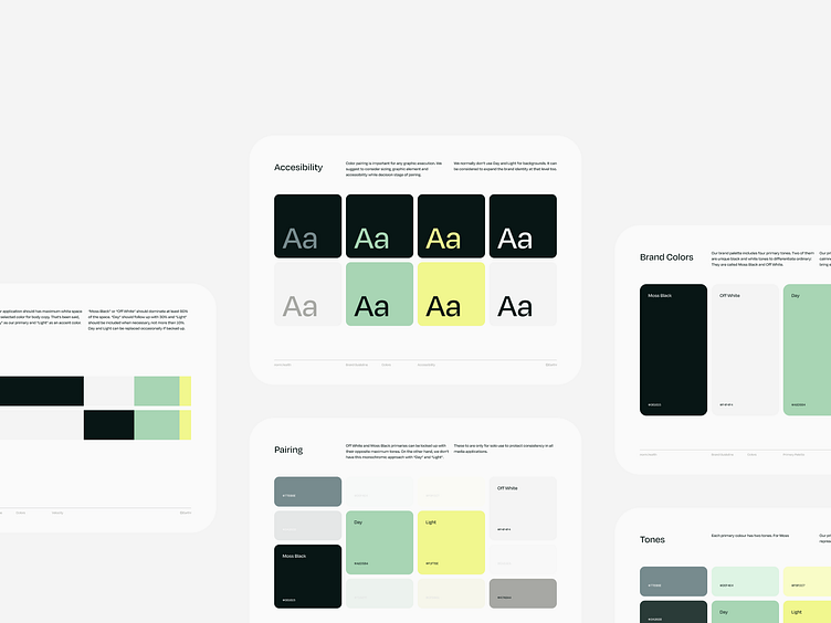
Our brand palette comprises four primary tones, each carefully selected to manifest the essence of Norm's brand identity. Moss Black and Off White are unique tones designed to differentiate Norm from the ordinary. Our primary tone, "Day," was inspired by nature, health, and calmness, reflecting Norm's commitment to long-term wellness. In contrast, our accent tone, "Light," adds a burst of energy to the everyday routine, infusing Norm's brand with vitality. To ensure maximum visual impact and legibility, we prioritize using white space with careful attention to color pairing and the velocity of the composition.
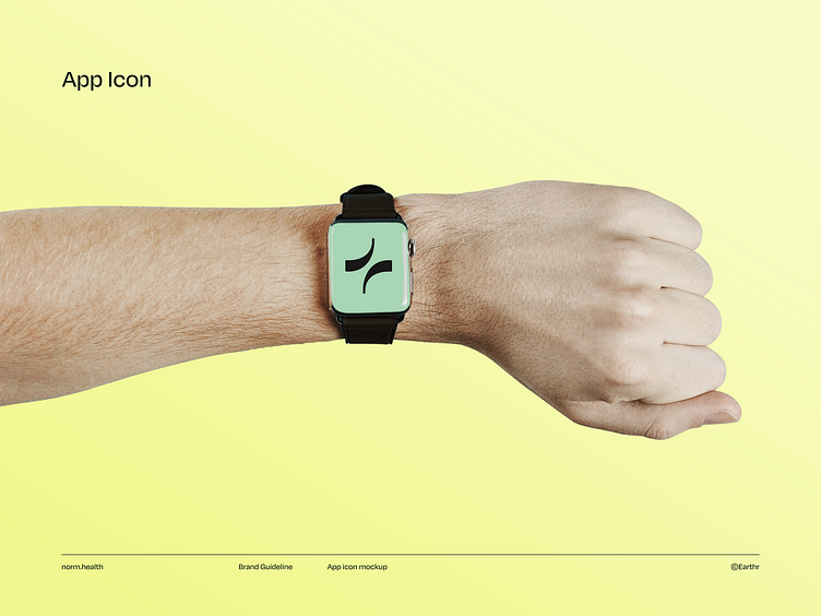
App Icon (Pattern)
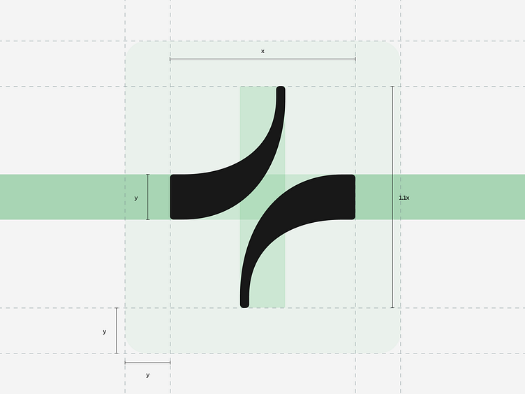
As reflected in the brand story, the sholder in "r" letter provided an excellent opportunity to incorporate a stylized heartbeat as an icon. After several iterations, this design was systematized and turned into both a pattern and an app icon, available for use both together or separately as needed.
Team
It's Tilly Concept development, brand identity, all deliverables
Earthr Feedback rounds and client engagement
Let me know what do you think in the comments! Press "L" if you liked it.
Thank you for reading! See on the next projects :)
