UI Sixteen
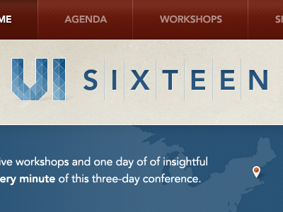
I couldn't find a good way to show a 400x300 crop of the actual site, so this is a composite of a few elements I'm working on.
I'm not sold on the 3D shadow on the logo, but it seems marginally better than a drop shadow here.
More by Dave Shea View profile
Like
