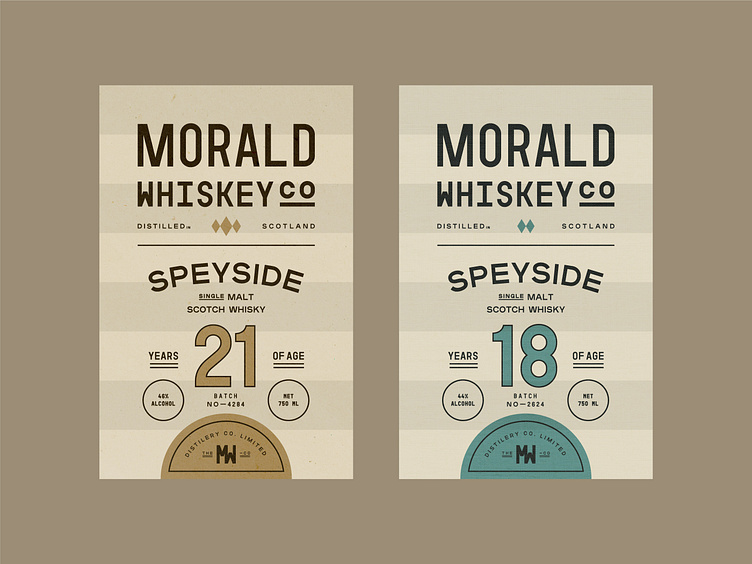
Whiskey Label Design Concepts 🥃
Which one would you try🥃? Considering the age of this whiskey, we went with neutral colours that give off a nostalgic energy, while the logo with its Condensed Sans Serif typeface and the font game create a modern and timeless look.
Press "L" if you love it ❤️ Thanks! Thank you in advance!
Let's work together!
— Do you have a project? 📩 projects@markaworks.com
— Visit our website to see all the project presentations.
More by Marka Works Branding Agency View profile
Services by Mustafa Akülker
Like
