Nokia logo Concept
60 minute challenge
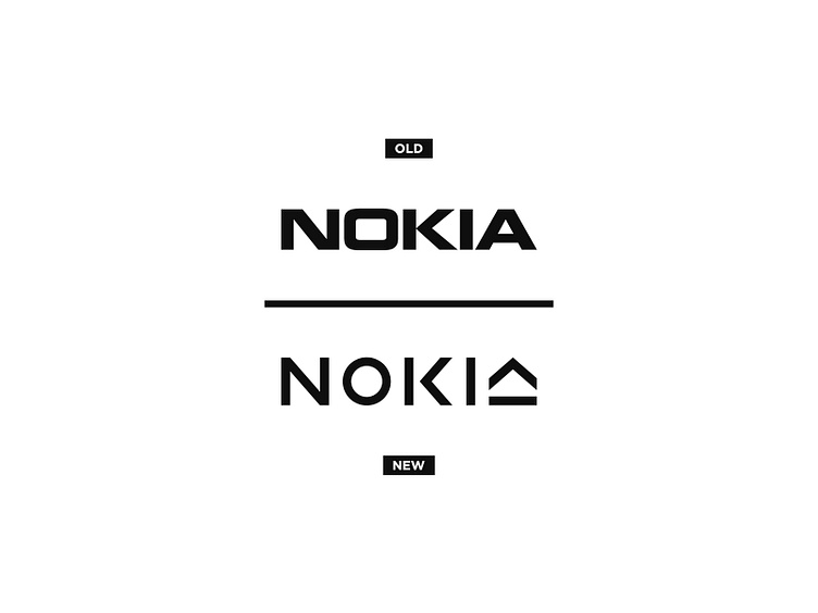
The new 2023 Nokia logo was not quite what I was expecting.
It feels fresh and modern, but also unfinished and legibility was clearly not a priority.
I decided to try and make my own version of the logo and see what I could do in under 60 minutes.
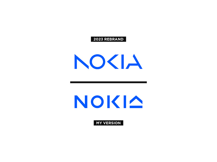
I went with a similar style as I didn't get to read the brief, and therefore this "modern" style must have been what they were after.
For my logo I wanted to improve on legibility but at the same time incorporate an icon in the logo, something with a positive direction. Therefore I made a 'K' that could easily be rotated to also be the 'A'. Not the most legible 'A' but it had to do as I only had 60 minutes.
To further improve on legibility I increased the tracking and made the letters slightly thicker. Now it is easily readable and recognisable even when really small.