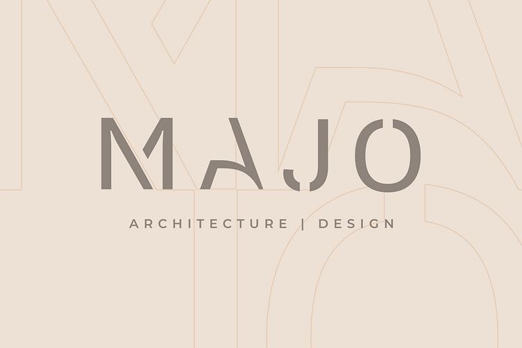
Majo Architecture and Design Office
The visual identity for Majo project is based on a minimalist and simple approach, utilizing geometric shapes as the primary element. The design is clean and sophisticated, reflecting the precision and attention to detail that is integral to the practice of architecture and interior design. The use of geometric shapes reinforces the idea of structure and organization, while the simplicity of the design ensures that the focus remains on the work itself. Overall, this visual identity communicates the professional and refined nature of this architecture and interior design office.
𝐈𝐧𝐭𝐞𝐫𝐞𝐬𝐭𝐞𝐝 𝐢𝐧 𝐰𝐨𝐫𝐤𝐢𝐧𝐠 𝐰𝐢𝐭𝐡 𝐦𝐞?
Feel free to reach out via DM or by email:
👉 office@mcraftstudio.com


