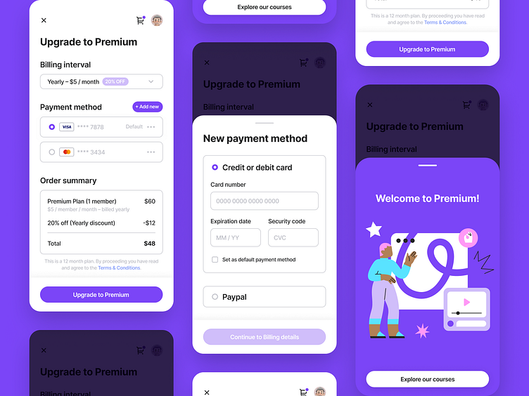
Daily UI #002 — Credit card checkout
Maybe worked a bit too long on this one, had to finish it the next day, ha!I really wanted to incorporate quite a few things for this one. Had a whole list and everthing! But I narrowed it down to all the elements on the 3 screens here.
Those notes will come in handy for next time. I've also started saving my references, so I can come back and further develop my ideas from these design challenge pieces. Picking up some good habits already!
I caught myself thinking about spacing and slight color nuances a lot while working on this one. Need to work on that.
Don't get me wrong, I appreciate that I kept focus on those aspects but to me the point of this exercise is to let go of all this and just make what you wanna make.
The next one's a landing page, so I'm not sure how much I'd be able to follow my own advice but we'll see!
Any sort of feedback is well appreciated! I'm here to get better.
Whatever you decide to do, thanks for being here.
Mato out.


