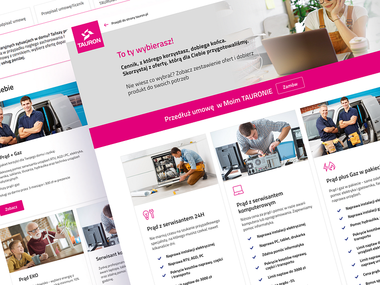
Tauron – strategic changes on the website
Hi, Dribbble community,
I wanted to share a project I worked on back in 2020. It was some redesign of the Tauron website, which aimed to reflect the changes in the company's communication strategy and the increasing role of the online channel in contract handling. Tauron is the largest electricity supply company in Poland. I was doing this project in a team at 19 Meridian LTD.
My role in this project was to design sales, service, and product pages and create appropriate graphic elements for marketing campaigns. The goal was to tailor the website to meet customer needs and offer products most effectively.
To achieve this, I focused on simplifying the language used on the website and emphasizing visualization. We opted for a direct, user-friendly approach that utilized easy-to-understand language and natural, warm imagery. We also created universal modules and sections to organize the site's structure and make it easy for users to navigate.
Additionally, we placed a strong emphasis on mobile responsiveness, as the majority of users accessed the site from their phones. We also designed the pages with the online channel in mind, redirecting traffic to the online Tauron platform. I did help Tauron adapt to the changing landscape of online communication and contract handling.
Thanks!
See you soon ❤️
—
Liked it? Press "L"!

