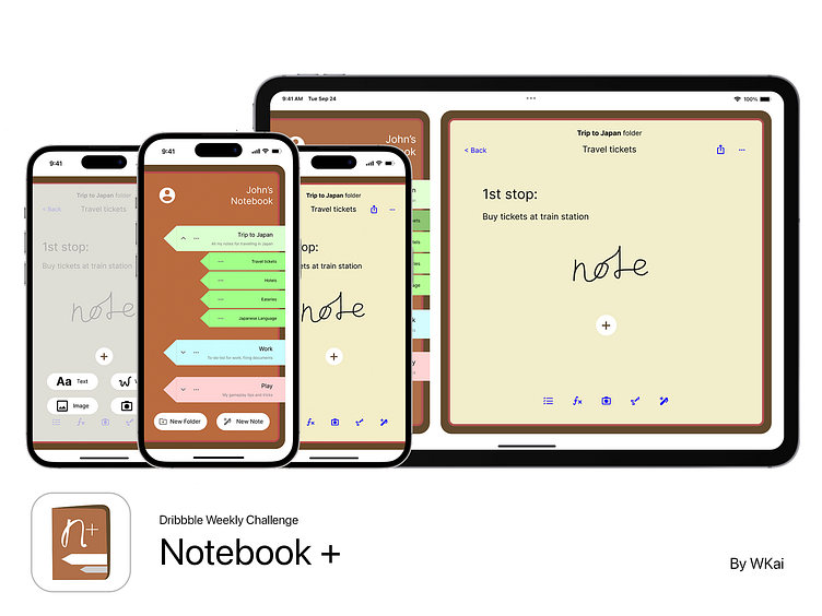
Notebook+ app UI
👋 Hi Dribbblers! 🏀
This is my attempt for Dribbble weekly challenge: to design a note taking app!
Simulate taking notes in a real notebook
My home page design is inspired by a notebook, with bookmarks on the cover page.
The larger bookmarks signify the group a note belongs in.
How to use?
Tap on the large bookmarks to reveal or hide all notes within the group.
Simply tap on the small notes to view and edit its contents.
Designed for large screens too
To make use of larger screens, I have also made a large screen version of the app.
The left margin shows all the notes you have made, the right margin allows you to edit the notes made.
Colour scheme
I chose brown as the theme colour of the app, as brown represents leather, which replicates the experience of a traditional notebook.
Yellow for paper colour, as it is the rustic colour that represents aged paper.
As for the buttons, blue is chosen due to its accessibility to most colour deficient users. The most common colour deficiency is red-green.
Thanks for viewing!
Feel free to leave any comments for this app :)
If you liked my project, please leave a like by pressing 'L' or giving a ❤️.


