Style Guide for Educational Event Booking Application
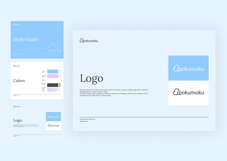
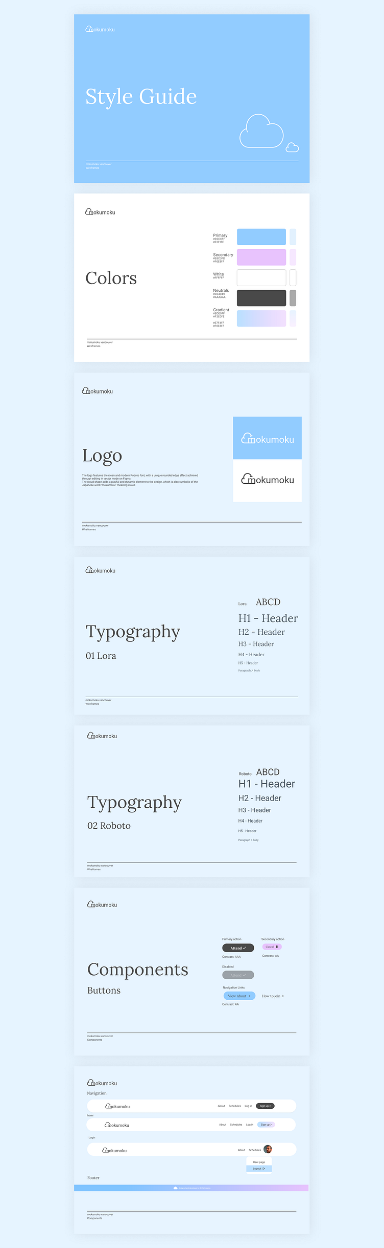
The UI style guide that I created for the educational event booking app, Mokumoku Vancouver, features a clean and modern design. The logo is playful and dynamic, incorporating a cloud shape that symbolizes the Japanese word "mokumoku".
The color palette includes light blue, pinkish, neutral dark gray, and white, with a gradient background created from blue and pink.
For typography, I chose an elegant font paired with a normal font, which is a popular trend in web design.
All buttons have high contrast accessibility above the AA level, and the style guide includes navigation and footer components for a common UI.
The focus of this style guide is on providing an intuitive and visually appealing design that enhances the user experience by prioritizing consistency throughout the app.
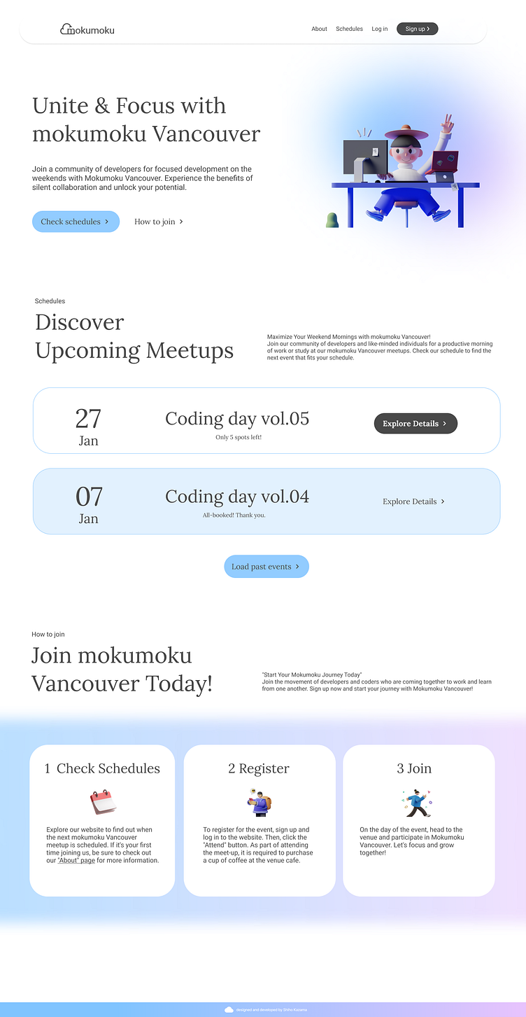
Design created using this style guide
Shiho mia Kazama | A front-end developer
I am a UI-focused front-end developer based in Vancouver with experience in coding React websites and using Figma for design.
I believe that understanding UI is essential for front-end developers, which is why I took design courses to learn the fundamentals of UI design.
Stay tuned for my feature project!
You can also view my Portfolio, LinkedIn, and GitHub profiles for more information.
Thanks!
