Daily UI :: 001. Sign Up Page.
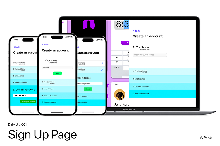
This is my first Daily UI challenge submission, a Sign Up page.
#DailyUI
Problem Statement
Many times, I find that the Sign Up Page has many fields to complete, which makes it intimidating for people to complete.
So, I designed my Sign Up Page, such that it has visual guides, guiding the user in the information he/she needs to fill up. It does not throw everything to the user at once.
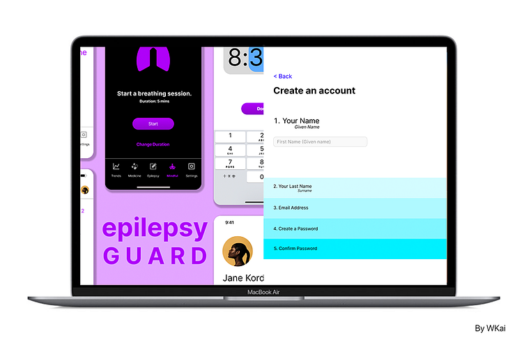
Desktop version
Furthermore, I have also created a desktop version of the Sign Up Page. It caters to the larger screen, providing users with more information about the website.
In this case, it is Epilepsy Guard's sign up page.
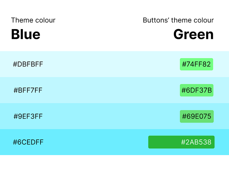
Sign Up Page Colour Scheme
I used blue as my theme colour, as blue represents the trust formed between the users and the product's company.
Green is used for the buttons, as it generally is represented as verification to users.
What do you think of my Sign Up Page? Let me know in the comments :)
Press 'L' or ❤️ if you liked my work. Thanks for watching!