My United - Case Study
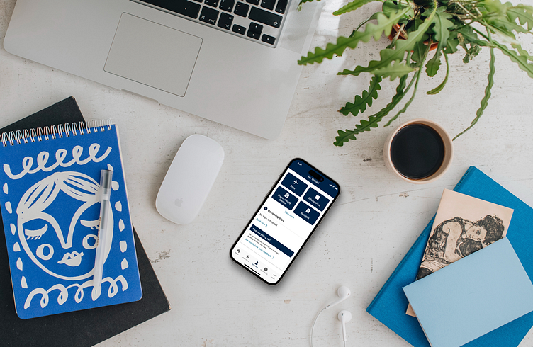
A new way to organize your "stuff" in the United mobile app.
Project Overview
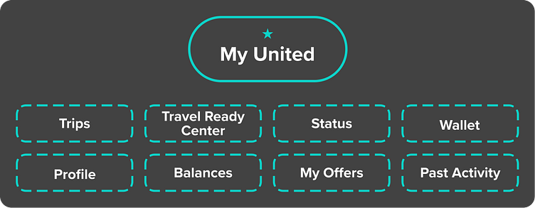
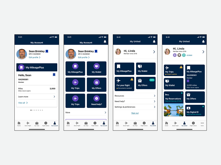
The My United initiative was a way to organize a traveler’s most important items into one central location. The previous version of the application involved navigating to an ambiguous “More” menu where everything was stashed away under sub-menus.
This new and improved placement allowed the user to easily get to the most important items they would need at any given point of the flow.
Role: Design lead for the Customer Management, mission-based team.
Team members: Myself (design lead), a Product Manager, engineers dedicated to our MBT and user researcher
Tools used: Sketch, Invision prototyping
Project length: 6 months
Problem: Changing the function of the center navigation button. Moving important items to a new location
Nala - Business Traveler Persona
Nala goes on business trips 3+ times a month. She is looking for an easy to use experience with great UX. Shopping around for deals is less of a concern and brand loyalty plays a large factor in decisions. This is where delivering a great mobile experience is very important for this specific user group.
Key goals and needs:
Find the best flight options and make purchases quickly
Quickly access my stuff while traveling
Pain points:
Constantly need to re-enter personal information for programs and purchases
Travel booking process spans over multiple platforms
Having to tap multiple areas to get to important day of travel information
Defining the MVP
Previously, these features were added to the more menu where there are over 25 different menu items to select from. By creating My United, these features would get more attention and create an area for all of the user’s “stuff”.
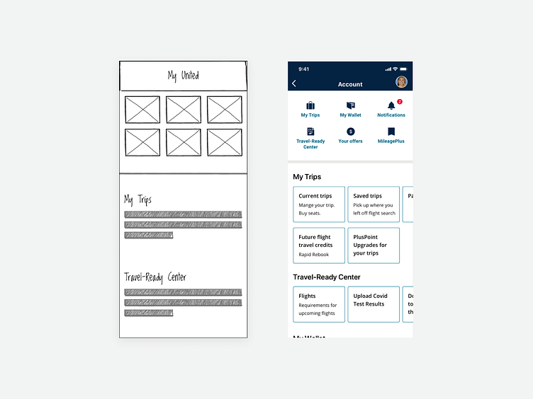
Wireframing
Design share-outs were on a weekly cadence. Early on, low-fidelity mockups were shown to make sure that the functionality made sense with stakeholders.
Iterate
Although our team wasn’t on a sprint schedule, we were still iterating fairly quickly due to the weekly cadence of stakeholder feedback.
This allowed time to think through different treatments and what would be best for the user.

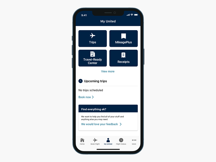
Version 1.0
The design we laded on put a lot of focus on the four most utilized contextual cards, but allowing a clickable “View more” to make a compromise from stakeholder feedback. Originally there was a push to have six cards visible at once, but this would push the Current Trips section to below the fold.
The original release was pushed out to a group of MileagePlus users.