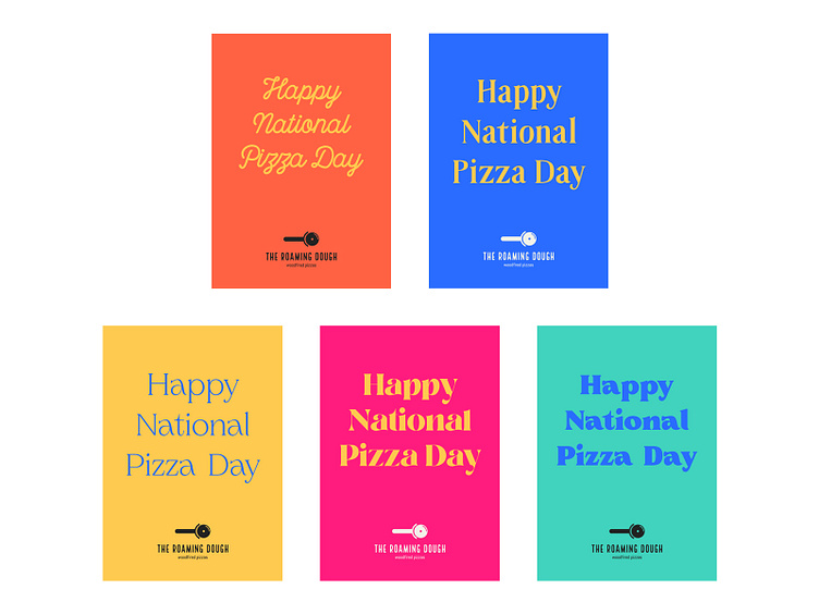
The Roaming Dough Typography
Case Study - https://medium.com/p/35261db84513
One of the main aims of this rebrand was to introduce a third font that could be used for headlines and give the brand some energy and life. The typeface had to pair well with the existing Local Brewery and Abel and also have bundles of character.
I experimented with lots of options for the third font before creating the above posters.
These were some of the typefaces I considered initially:
These were the type posters from the first round:
The project was paused for a number of months while Suzanne relocated and these were the fonts I considered when we picked up the project again:
More by Katherine Cory View profile
Like


