"Weather or not" - Simplifying Your Forecast Experience
The Ideation and Thought Process Behind the Minimalist Weather App
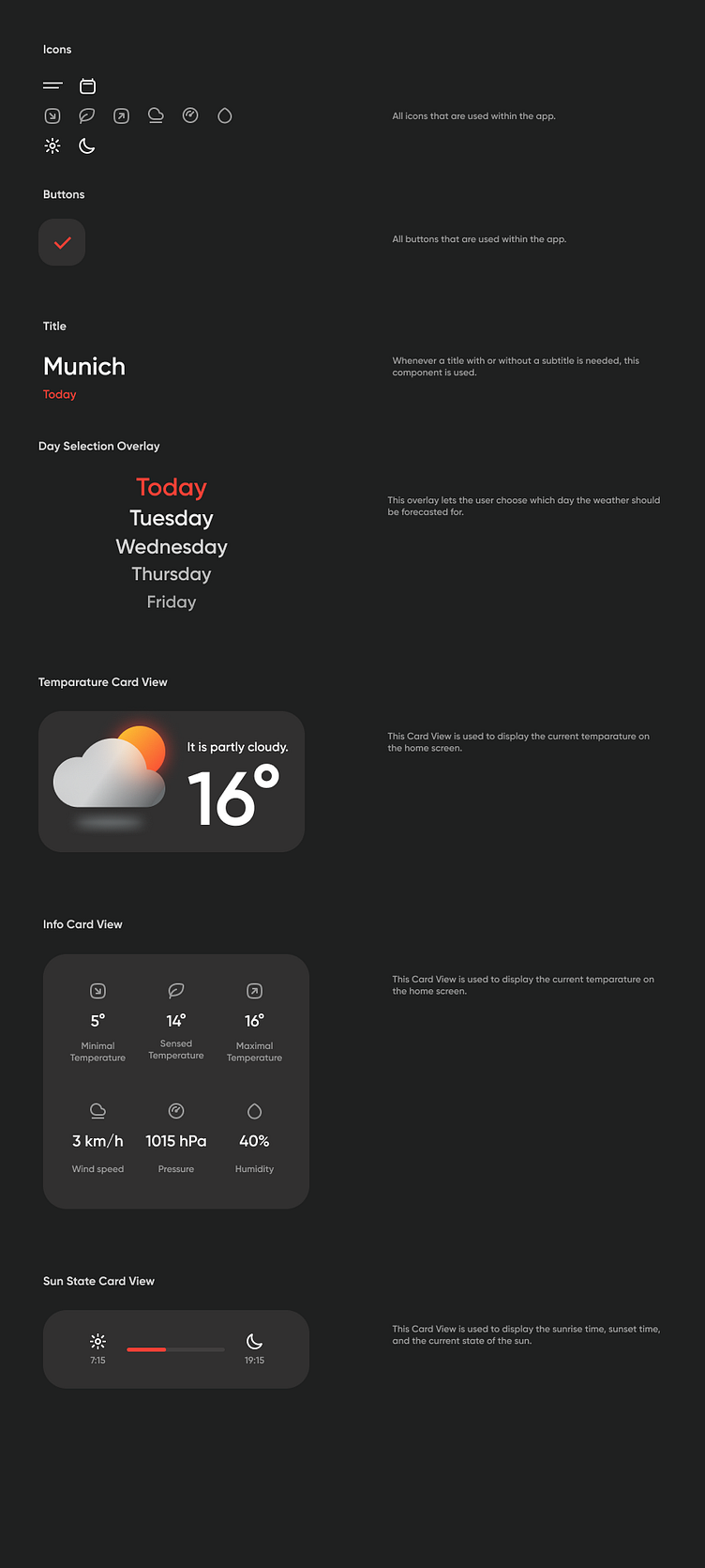
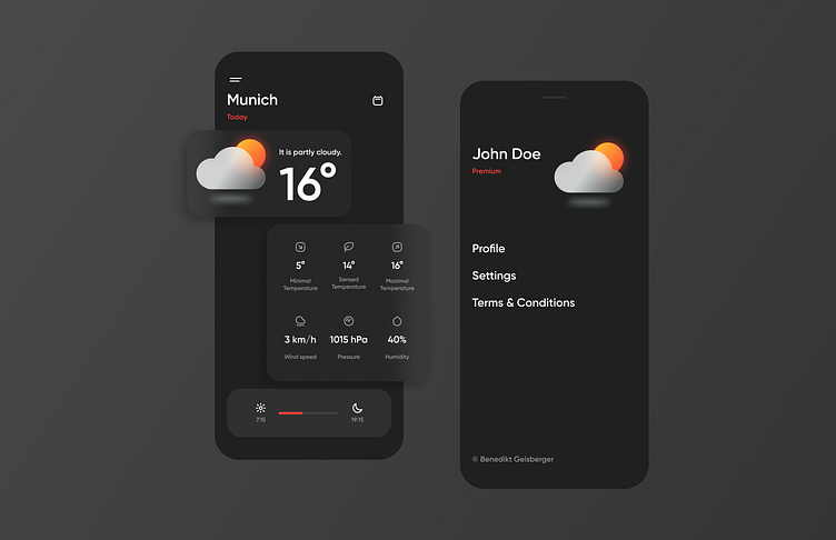
The overall design goal was to create a simple and intuitive interface that would allow users to quickly access the weather information they need without any unnecessary clutter. To achieve this, I made use of a clean and minimal color palette, which consists of only a few muted hues.
In terms of layout, I focused on creating a clean and easy-to-read design that would be user-friendly for all types of users. This involved simplifying the information displayed, so users can quickly see the temperature, weather condition, and any relevant weather alerts.
I also made use of simple and easy-to-understand icons to help users quickly understand the different weather conditions. The typography was kept clean and easy-to-read to ensure that users could easily see the weather information at a glance.