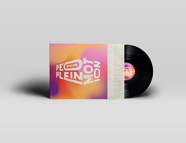
Typographic People in Motion Vinyl Cover
The People in Motion Vinyl design was approached with a typographic eye. the goal was to create a simplistic album cover that stemmed from the existing one. The color scheme was fueled by colors found in the main album's core element, the 3D block. Those colors were displayed in dynamic gradients across the packaging and even into the vinyl jacket. At first, the vinyl's jacket had the same sting and vibrant gradient occupying the background, but in efforts to improve legibility and balance a beige was used to neutralize and even out the strength from the highly saturated cover. To see the beautiful gradient ingrained throughout all the elements, it was taken into the text fill of the lyrics found on the beige jacket. The end product leaves us with a dominant typographic focus with fun envloped forms.


