Quick Nokia logo Mockup
I'm a firm believer in the use of Icons as our brains register them differently than we do words.
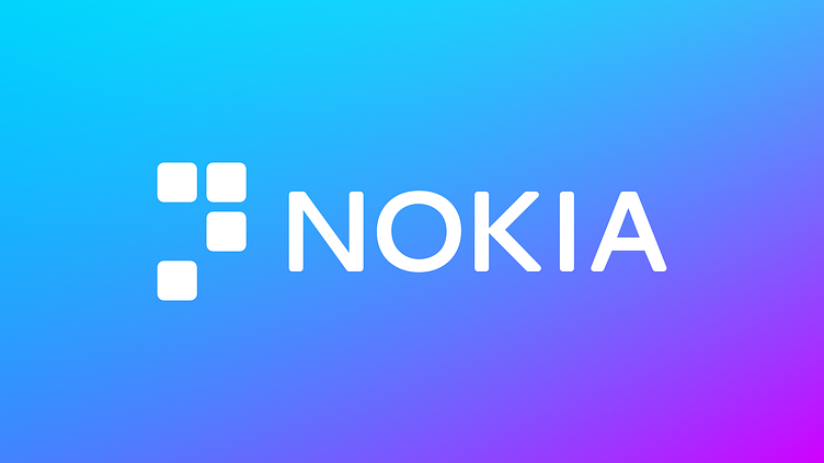
After some research I found that "Nokia" translates to "Soot" which gives the idea of particulate/fine particles which gave me the idea to use dots or squarish shapes, this thought lead to Braille which is what the icon based on and is a modified braille N.