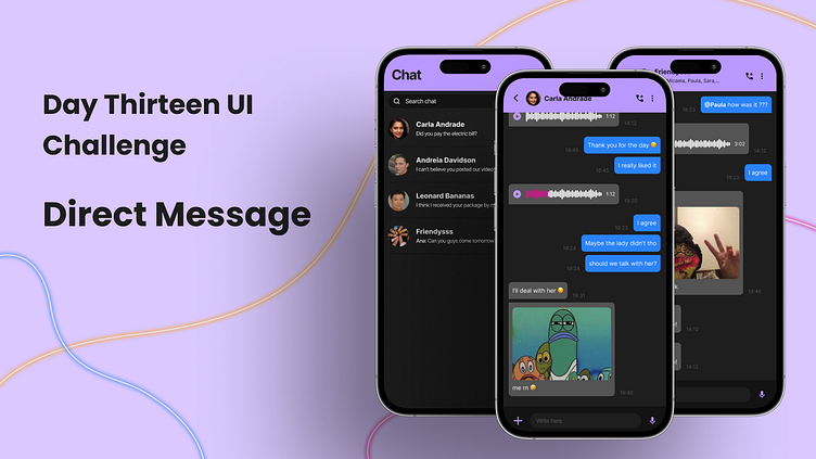
Day 13 UI Challenge - Direct Message
Hi designers and every one of you👋! It is great to see you all here.
I am a junior UI/UX designer keen on learning and willing to grow what I have learned. Since I am a junior designer, I should do designs regularly to improve my skill set, I started doing this 100-Day UI Challenge to see how far I can improve in this short amount of time.
Today the challenge was about a Direct Message since it was around a messaging app I took it upon myself to make other important pages.
For this design, I created the mood board above! To make this I researched some message apps and even arrangements of other creators on Dribbble.
I wanted to portray a young nightlife-ish vibe to the app, and with this, in mind, I opted for darker and saturated colors and a simple font.
For the low-fidelity prototypes, I started working on the different screens I wanted to create.
The first screen is the list of chats, where the user will be able to create, edit, search, and access a conversation.
In the top bar you can find the edit and create features, they were put there so that these were visible all through the screen since the bar it's fixed at the top.
Each item of the list contains the image and the name of the other user that belongs to the specific chat, and also displays the last message and the time it was sent.
In the case of the list item being a group chat then the picture is chosen by the admin and the name displayed is the group's name.
The second screen is the focus of today's challenge, the direct message. In this screen, the user can write a message, call the other user in the chat, and send media and an audio message.
In the top bar, you can find the go-back button, the other user's name and the possible actions like calling, and a dropdown list of other features like block, report, share contact, etc. I made it this way so that it was scalable.
In the center of the screen, there are messages sent from the participants of the conversation.
Each message has its content, may it be audio, media, or text, and the time it was sent.
In the bottom part of the screen, the user will find the feature to add media, write a message, and the possibility to record audio.
When the user writes a message then the audio icon is replaced by a sending icon.
The last screen it's the same idea as the second one, but the difference is that it is in a group setting. The biggest difference in this is that other people's messages are identified by their profile picture and name so that the user doesn't feel lost on who sent each message.
For the high-fidelity mockup, I wanted to bring my design to life with a more polished visual aesthetic. I focused on refining the typography, color scheme, and layout of the user interface to create a more seamless and intuitive experience for the user.
One challenge I faced during this stage was finding the right balance between simplicity and functionality. I wanted the design to be visually appealing without sacrificing usability, so I made sure to test different variations of the interface to ensure that the user experience was as smooth as possible.
One change you might have noticed if you were paying attention to the detail of the low-fidelity and the high-fidelity mock-ups, was the position of the time the message was sent, which due to the UI I felt it fitted best on the side of the message rather then bellow since it was unused space.
Overall, the Direct Message UI Challenge was an exciting opportunity for me to explore new design concepts and push my creativity to the next level.
From the initial inspiration of my mood board to the final high-fidelity mockup, I was able to refine my ideas and create a user interface that I'm truly proud of.
I'm looking forward to hearing your thoughts and feedback on my design, so please don't hesitate to share your comments below.
Thank you for taking the time to check out my work!💕


