Velium logo design

Deciding that there needed to be a one-stop-shop for all things custom PC builds, Velium wanted to take this industry by storm by ensuring they sold everything required to build a custom computer from scratch for all skill levels. They wanted a brand that felt techy without alienating potential gift givers too much.
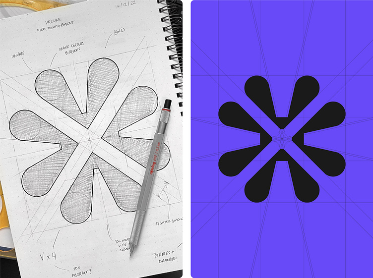
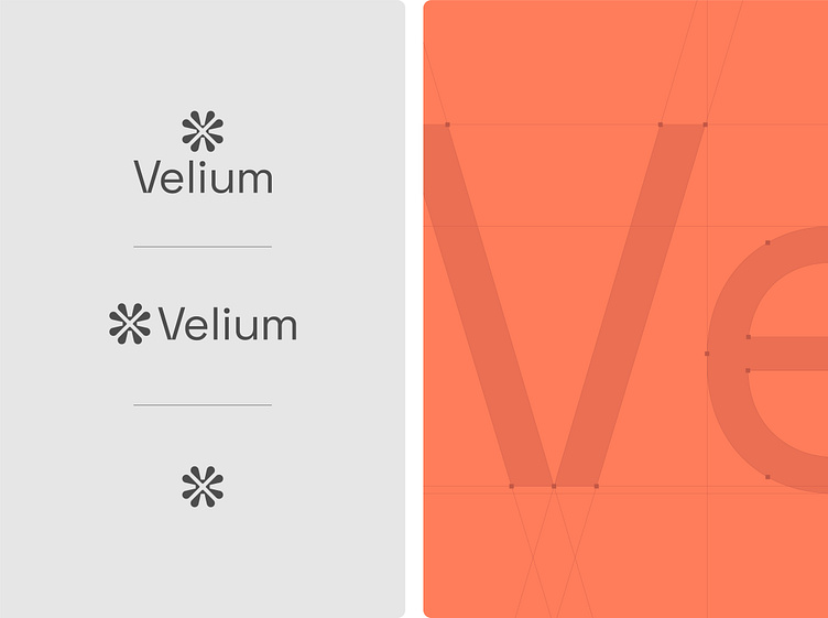
After my research and word mapping stages, I started sketching lots of different ideas trying to be as abstract as possible with the goal of toning it down once a route was selected. I quite liked the concept of combining V letterforms in a way that felt like they were converging/building a community. I tried many different options but fell quickly in love with a rougher version of what you see here. Once refined, I set my sights on customising some type to match the logomark.
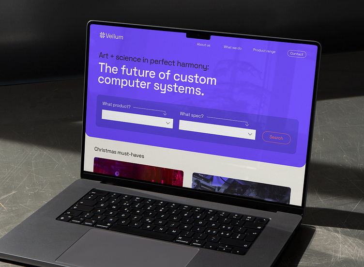
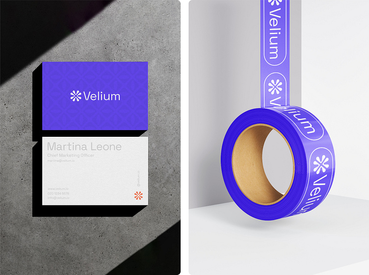
Space Grotesk had the perfect balance of legibility and uniqueness I was looking for but I felt there was more I could do to make the logotype more ownable. Outside of very subtle tweaks to the other letterforms, the biggest change was recreating the V to give off more techy vibes by preventing the stems from crossing over. This added a refreshing bit of tension to the logotype. The final step was selecting a colour palette - looking back at the brief, I didn’t want to go too digital and distance Velium from their target audiences so I decided on a vibrant purple supported with a myriad of grey hues and a burst of orange for highlights. Super happy with the finished product!
Fancy creating or refreshing your brand's identity?