Ucraft Next: A Reflection of Ucraft's Rebranding
As a SaaS company actively entering the eCommerce space, the Ucraft website builder team was thrilled to have been invited to the eCommerce Expo at ExCel London, 2022.
It was a unique opportunity to network with fellow SaaS and digital commerce enthusiasts and a fantastic occasion to brush up on our design skills and create eye-catching booth designs, flyers, and merchandise for our brand. And looking back at these photographs, it certainly looks like we succeeded in reaching that aesthetic milestone.
Since we're about to roll out our new and improved intelligent eCommerce builder, Ucraft Next, we needed to revamp our staple Ucraft branding and create a new perspective for our already well-established website-building solution, which led to some interesting design choices.
Let's take a look.
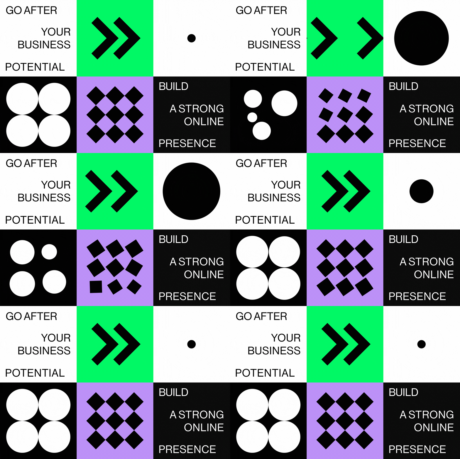
Looking at the designs, it becomes clear that Ucraft prefers specific shapes and colors to showcase the new and improved branding.
Our brand ideology starts from the center, a circle that revolves around ideas, takes on different shapes, and goes in tandem with our letter "U" (which stands for Ucraft). The circle adopts different sizes, colors, and even textures depending on the medium used.
The Ucraft brand primarily consists of black and white colors, which reflect the brand's simplicity and straightforward approach to website building. Likewise, a brighter shade of green has been chosen as the third primary color for our eCommerce solution since it's eye-catching and works harmoniously with our entire color palette.
We also made the decision to incorporate pixelated sections into our booth designs to reflect the addition of our visual editor, envisioned to help web designers build pixel-perfect online stores.
Art Direction - Sona Safaryan
Concept Design - Sona Safaryan | Lusine Gasparyan
Interior Design - Lusine Gasparyan
3D Artist - Ruben Azatyan
Graphic Design - Gayka Saghoyan | Lusine Gasparyan | Knar Boyajyan
Motion design - Emin Ganjumyan


