Daily UI Challenge #030|| Pricing
Design Challenge Experience
The hardest part in this challenge is creating my own product to price. The best I could give was 70%. I used Figma and ProtonVPN as a reference for this design.
The Design
My initial design was to make different styles for each pricing. From simple to detailed with colors and design. I realized that, even though it is pleasing to the eye, it could be confusing for the users.
I have to different designs in my mind.
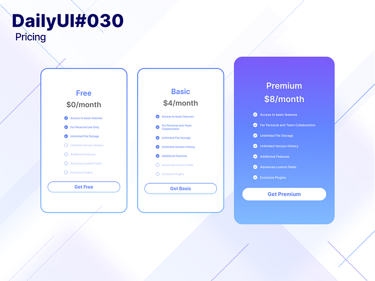
First design I have is that only the Premium plan has the full color and bigger in size and the rest is on white background, making it look like it is recommended since it has way more benefits.
Now, as a student, and always a free user, I really don't pay much attention to the other benefits as long as it is free, and I'm able to use the product the way I wanted to. Maybe along the way, as I get older and have more money in my hands, my perspective will change.
The second design I have in mind is that when you hover on a plan, it will turn scale into a bigger size and have a gradient background from violet to blue, just like the premium one in my shot.
I only provided the pricing design since I do not have much time in my hands. 70% a day is better than none.
