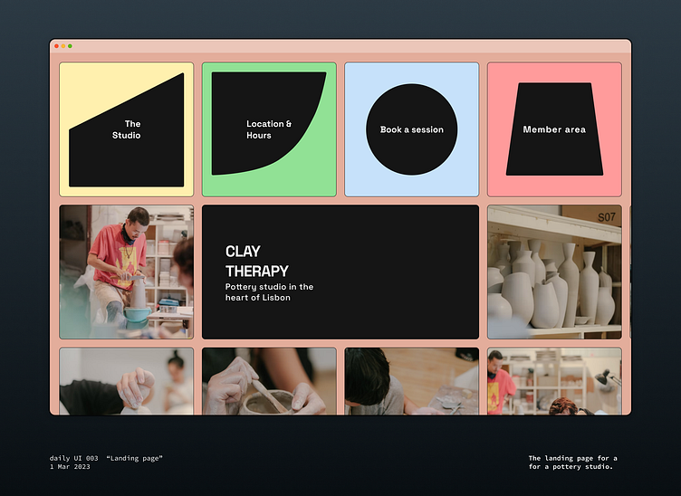
Daily UI 003 - Landing page for a pottery studio
Third day of the daily UI challenge from https://www.dailyui.co/ . Stuck with the pottery studio theme again because I wanted to try something that isn't just the Linear landing page.
When designing a landing page, I think showcasing the brand and the product should be the number one job. For a brick-and-mortar business like a pottery studio, I think the obvious way to showcase this is either with the products (ceramics produced at the studio) or with the experience (how it feels doing a session there). This led me to use photography as the main tool (Photos by Pew Nguyen on Unsplash).
I also wanted to try something different from the typical landing page. I merged the concepts of the nav bar and the CTAs to get overblown blocks at the top which I quite like.
The studio doesn't actually exist but I like the name I found for it: Clay Therapy. Manual creative work like pottery can be like meditation.
