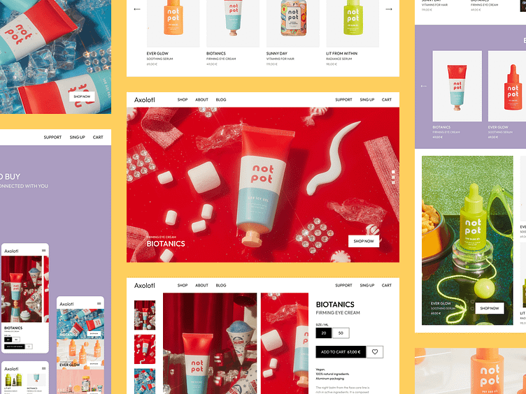
🌟 User Experience: Not Pot Website
🎨 Experience: Join us as we present our latest case study – the redesign of Not Pot cosmetics brand website. Our mission was to improve the user experience by adding structure, functionality, and overall usability. We rebuilt the site's composition across four key pages.
🎉 Design Aesthetics: Departing from the classic delicate pink palette of the old website, we added new life into the design with bold, bright colors and intricate detailing. Our modern approach to usability guarantees a visually captivating experience that resonates with users.
📱 Custom Mobile Apps Chicago: Our dedication to excellence shines through in every aspect of the redesign, offering users the Not Pot cosmos. Press 'L' if our design resonates with you, and don't forget to share your thoughts!
Just drop us a line: hello@brightlab.me


