Day 4 — Daily UI Challenge

Day 4 of Daily UI Challenge
Challenges
Section to design: https://www.dailyui.co/
App idea prompt: https://ideasai.com/
Time: 1 hour
Brief
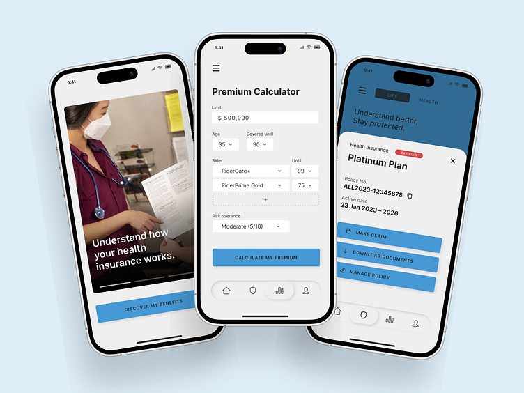
App to develop:
"A learning platform to help people get a better understanding of their health insurance."
Section to design:
Calculator
Concept
Since it's an insurance app, it should feel as trustworthy as possible, without being intimidating. That's why I used:
Hard rectangles with slight corner-rounding
Soft, contrasting colors
Neumorphism on the navbar.
What I did right
Getting the overall feel right. Blocking sections with large negative space helps getting the feel right.
What can be improved
Spending too much time on experimental Neumorphism. It took me 30 minutes tweaking with tricks I haven't mastered yet. It should be omitted to increase efficiency.
Maybe spend the extra time for something worth tweaking and already mastered, like picking better headline typeface.
• • •
Hope it inspires you.
Cheers,
Mike Ferrari