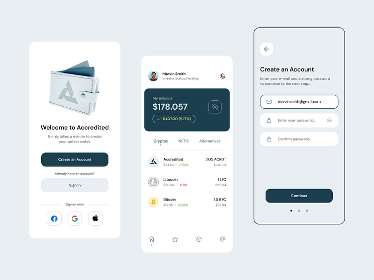
Accredited App UI
It's been a while since I last posted, so here is something from my favourite project of last year.
The old Accredited user interface was just not good enough to compete in the market with brands like Coinbase & TrustWallet.
Our priority was making a new and improved version of the app that will have a simple, modern design that will fit with the new brand identity.
And at the same time we put together some research and found the biggest pain points for users of digital wallets, discovered many usability issues, and moved forward with correcting the UX problems & giving the user a more straightforward, intuitive experience.
Big thanks to the Accredited Team for giving me a chance to work on this project.
Have a great & productive Wednesday!
More by Mihajlo Tunev View profile
Like
