Socient Brand Identity
Hi Mate 🙋♂️
We are proud to present our portfolio oflogos and brand identity for Socient! Our logofeatures the initial "S" which reflects the strengthand professionalism of the business, while thecombination of collaboration objects showspartnership and collaboration.
If you want to improve your brand identity, feel freeto contact us at rukurustudio@gmail.com or send usa DM. Let's work together!
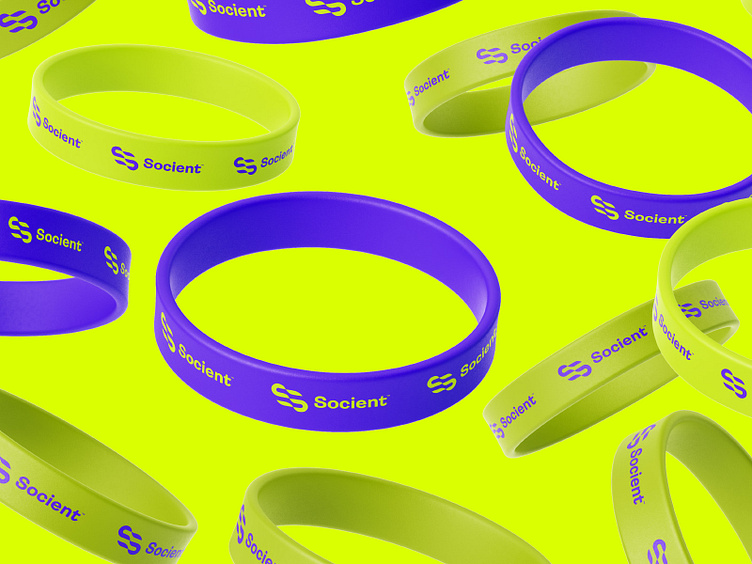
Concepts → The Socient brand aims for a modern, trustworthy image with a clean and minimalist style, using purple blue and light green colors and sans-serif fonts like Ambit & Manrope. It can be used on different media with consistency for easy recognition.
The Logo → The Socient logo is a combination of the letter S and a symbol of collaboration. The S is stylized in purple, and a light green shape at the top-right corner represents collaboration and growth. The clean and minimalist design of the logo conveys professionalism, modernity, and innovation, reflecting the values of the Socient brand. Overall, the Socient logo represents a modern, trustworthy, and collaborative business and consulting firm.
Implementations → The Socient brand can be implemented on stationery and business cards with a clean, minimalist design featuring the purple and light green logo and a legible sans-serif font. The design should reflect the modern, professional, and collaborative values of the brand, using high-quality materials for a lasting impression. Overall, the stationery and business cards should convey the same image of a modern, trustworthy, and innovative business and consulting firm.
Please share your thoughts!
Contact us to get your logo design or branding project done
Email: rukurustudio@gmail.com
Find us on:
Behance | Instagram | Freelancing Platform 99Designs
© 2023 Rukurustudio | All Rights Reserved.


