Branding | Writers Inkubator
Hey there, I'm excited to share with you one of my branding projects for Writers Inkubator. The goal of this project was to create a unique logo and color palette that would represent the company's mission of providing resources to aspiring writers to streamline the publishing process.
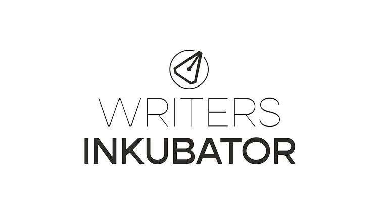
For the logo, I wanted to convey the idea of growth and development, so I used a stylized pen/cursor as the centerpiece. The pen symbolizes writing, while the cursor represents technology and transformation, two important themes for Writers Inkubator's clients. I also used clean, modern typography to create a professional and approachable feel.
In terms of color, I opted for a classic black and white as the main palette. This choice emphasizes the professional nature of the company, while allowing the content and imagery to shine. The use of black and white also gives the branding a timeless quality, ensuring that it will remain relevant for years to come. For the secondary color palette, I used primary colors in a muted scheme to compliment.
Overall, I'm thrilled with the final product and I believe it successfully captures the essence of Writers Inkubator's mission. The logo and color palette work together to create a cohesive brand identity that's both memorable and professional.


