Mhealth App - iPhone
CONTEXT
The Hispanic/ Latino community is disproportionately affected by diabetes, heart disease, and obesity. Health apps don't target this community even though they stand to benefit the most from its features. SALUDURIA is an opportunity to design a new mobile health (mhealth) app that empathizes with this community's cultural ties to food while promoting a healthy lifestyle.
THE PROBLEM
There is a strong attachment to traditional cuisine which is oftentimes not the most nutritional option.
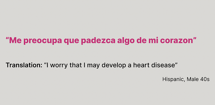
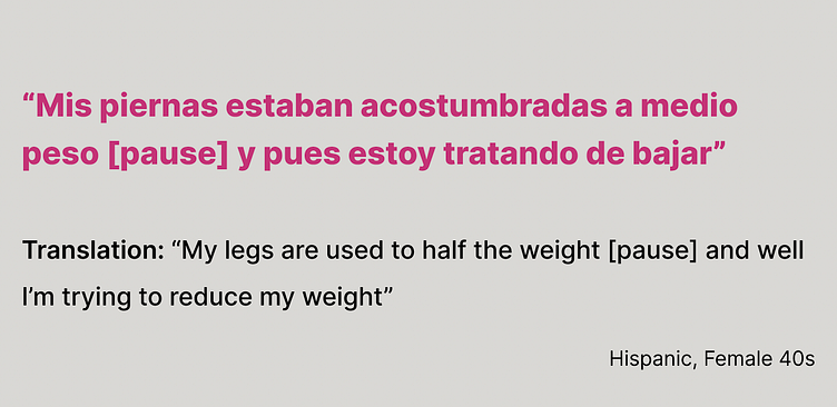
There is a large concentration of people who are primarily Spanish speakers.
Community support is essential for longterm success.
THE OBJECTIVE
Design an app that educates the Hispanic/ Latino on healthy living and motivates them to make sustainable longterm changes, without loosing empathy for their cultural traditions.
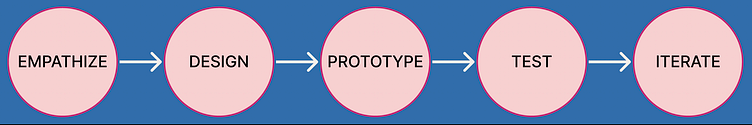
EMPATHIZE
I conducted semi-structured interviews and used that insight to categorize the top needs of our user demographic.

User Interview Takeaways
There is a desire to make longterm impactful changes
Users are receptive to learning
Internal and external motivation is appreciated
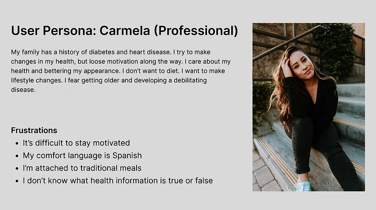
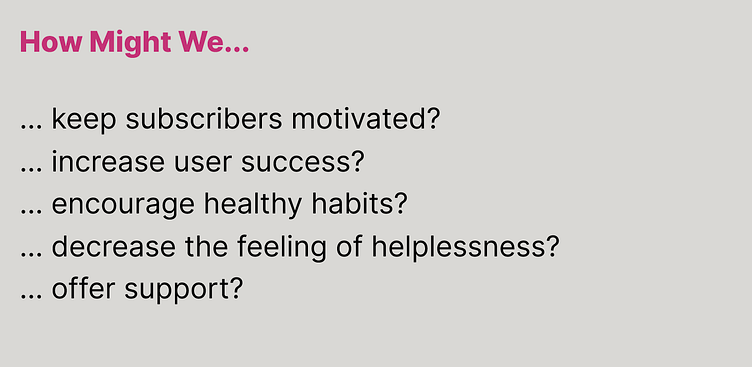
The goal is to design an app that has an inclusive narrative, is culturally relevant, and empowers the Hispanic/ Latinx community.
DESIGN
SALUDURIA should capture the fun loving, lively spirit of the Hispanic/ Latino community without losing sight of the importance of health through nutrition.
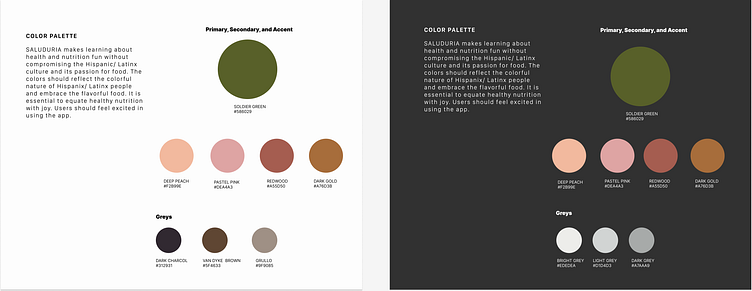
The ORIGINAL color palette of SALUDURIA was muted tones of green and browns. After impromptu user testing feedback showed that the colors were "boring" and "uninviting".
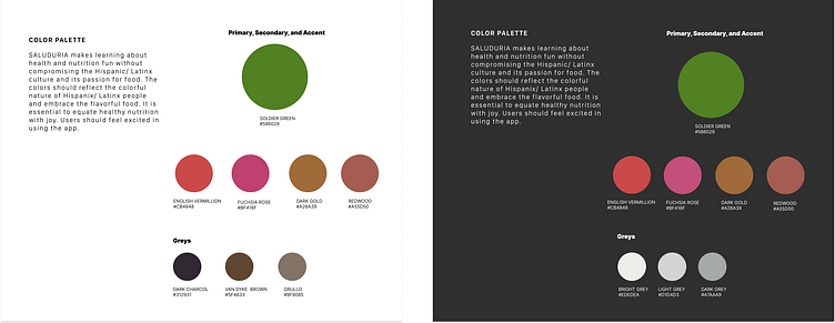
The REVISED color palette is more vibrant and engaging. Furthermore, the new palette matches the gaming aesthetic of SALUDURIA.
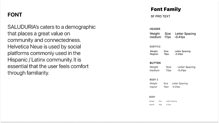
Although SALUDURIA is meant to be fun it also needs to have a serious feel. The SF PRO font shows the seriousness of the topic at hand, health.

Users should be able to navigate SALUDURIA intuitively. The app should function like a game where users can collect points and virtual rewards for keeping up with their health.
PROTOTYPE
In order to have an inclusive narrative SALUDURIA was designed as a bilingual app. Upon download the user is asked their preferred language. SALUDURIA is inclusive of Spanish speakers and welcomes them to tap into the benefits this health app has to offer.
In person interviews confirmed that users wanted reliable sources to EDUCATE them on healthy choices. Having nutrition articles followed by a mini quiz makes learning fun and engaging. Users earn points for passing the quizzes.
Prospective users expressed the desire for community support. To fulfill COMMUNITY SUPPORT and increase MOTIVATION user's can post short clips of their progress. The stories are on the homepage and in this manner the user has community support and nutritional education upon launching the app.
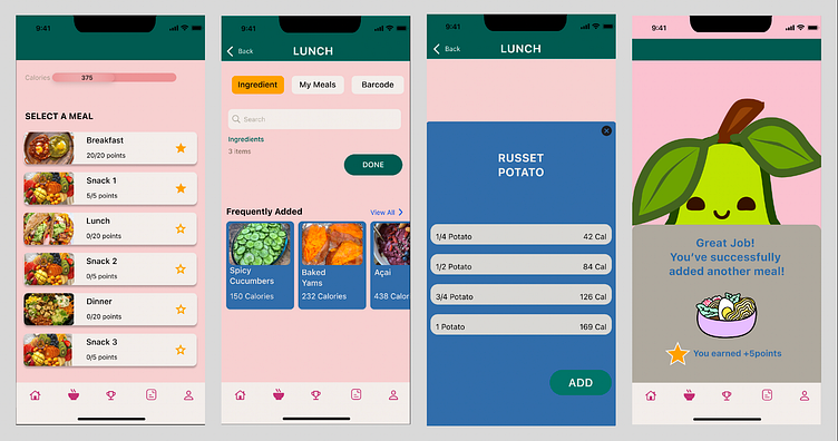
Logging meals can be mundane, to increase the likeliness that users will use this feature I designed it to be a game. Users earn points for logging meals in the app increasing long-term MOTIVATION.
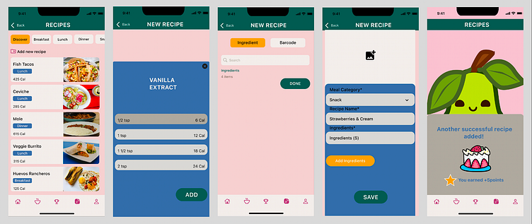
Similarly as logging meals, creating a new recipe is also encouraged by allowing the user to earn points. Users are MOTIVATED to save recipes to earn points. Saving recipes will also reduce time spent logging meals at a later date increasing user retention and habitual use.
TESTING
I recruited 5 users to test SALUDURIA. Users were between the ages of 25-55 years old and identified as Hispanic/ Latino. 2 of the users tested the app in both English and Spanish. All interviews were conducted in person.

POSITIVE FEEDBACK - Throughout testing users complimented the animations and gaming components. When asked what the most memorable part of SALUDURIA was users once again complimented the animations and gaming aspects of the app.
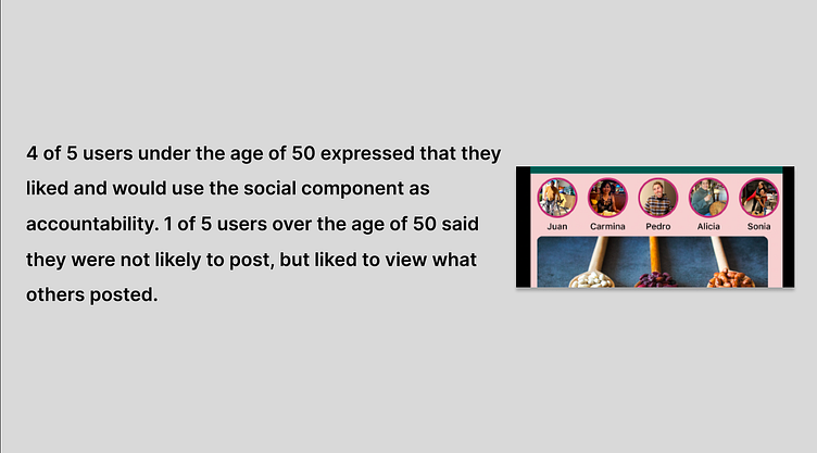
POSITIVE FEEDBACK - When testing the user stories component users used positive key words such as "community" and "accountability". These words were key indicators that SALUDURIA was targeting key issues of inclusivity and motivation.
ITERATE
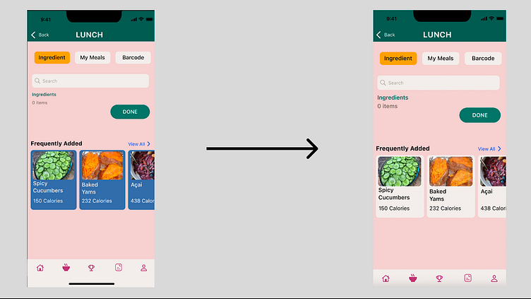
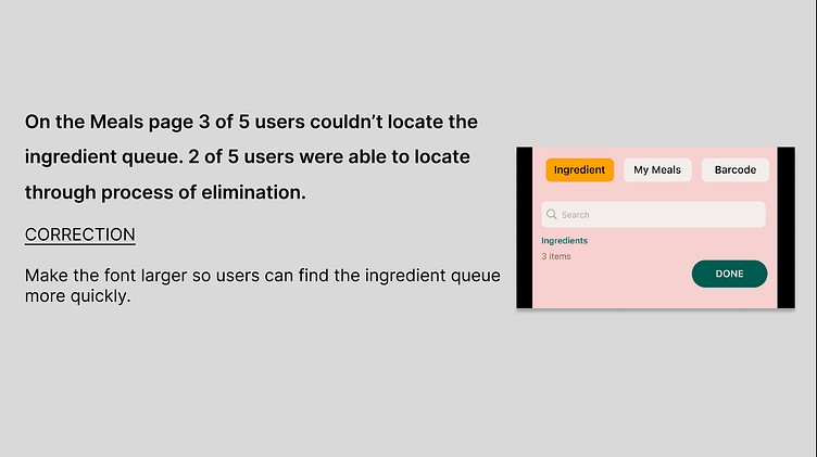
Changing the "Frequently Added" card color from blue to off-white balances the window in order to give the search function precedence. The "Frequently Added" will no longer be the main focus.
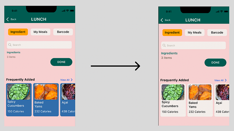
Increasing the font size of "Ingredients" will help users locate the ingredient queue quicker and with more ease.
CLOSING THOUGHTS
SALUDURIA's design successfully targeted the top 3 concerns of the Hispanic/ Latino community:
NUTRITION - Fast and efficient ways to log meals, save recipes, and track calories
EDUCATION - Users can learn about nutrition and health by having articles easily accessible on their homepage. Users are rewarded for reading the articles and proving their knowledge through points, medals, and rankings.
MOTIVATION - Users are encouraged to continue their health journey through Gameology and community support. Users are able to connect with friends and family through stories, compete for higher rankings, and work towards unlocking medals by earning points.
