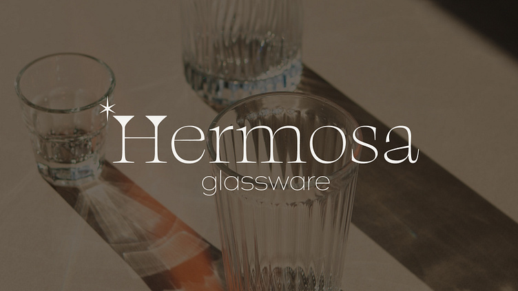
Branding | Hermosa Glassware
Hey there, I'm excited to share a recent branding project I worked on for a store that sells funky glassware. The project came from Brief Babes, and was to create a complete branding suite that included a primary and secondary logo, a color palette, social media assets, and packaging designs.
To start with, I wanted to convey a sense of exclusivity and nature, so I went with an earthy color palette. I chose colors that were warm and inviting, yet still had a touch of sophistication to them. The primary logo features a fun, playful font that perfectly captures the personality of the store's products. For the secondary logo, I opted for a more minimalist design, which can be used in smaller spaces, like social media profile pictures or product tags.
In terms of social media assets, I created a set of designs that are cohesive with the rest of the branding suite. I wanted to ensure that the store's online presence was as impressive as their physical products, so I designed a series of templates for Instagram stories, posts, and highlights that highlight the unique style of the glassware.
For the packaging design, I kept things simple but elegant. I designed a pattern that incorporates the store's primary logo and used it across different packaging materials, including boxes, bags, and tissue paper. The result is packaging that is both playful and professional.
Overall, I'm really happy with how this project turned out. The final branding suite perfectly captures the fun and unique style of the store's products while also conveying a sense of sophistication and exclusivity.


