Branding | Luna & Sage
Hi, I'm excited to share a recent branding project I worked on for a crystal and well-being shop, which required a logo, socials, and packaging design. The client's brief was to create a brand identity that reflected the holistic and healing nature of their business.
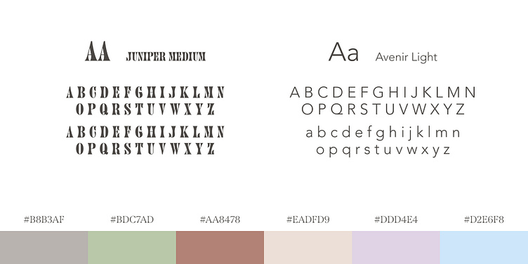
To achieve this, I chose a color palette of pastels, with a focus on lilac, mint green, and earth tones. These colors represent calmness, harmony, and nature, which align perfectly with the client's brand values.
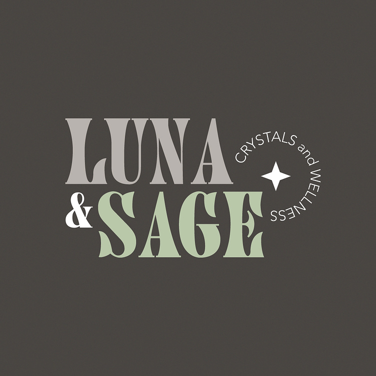
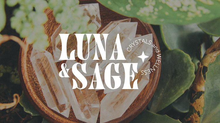
The logo is clean, modern, and sophisticated, capturing the essence of the brand perfectly.
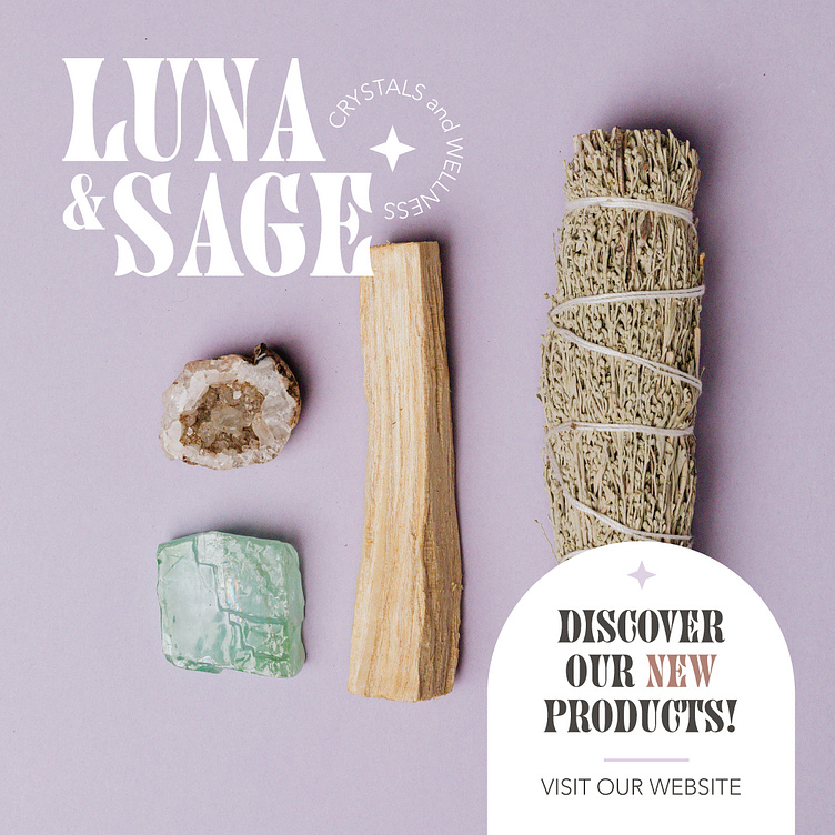
For the social media graphics, I incorporated the same colors and crystal element to create a cohesive and visually appealing feed. I also ensured that the typography and imagery used were aligned with the brand's tone of voice and values.
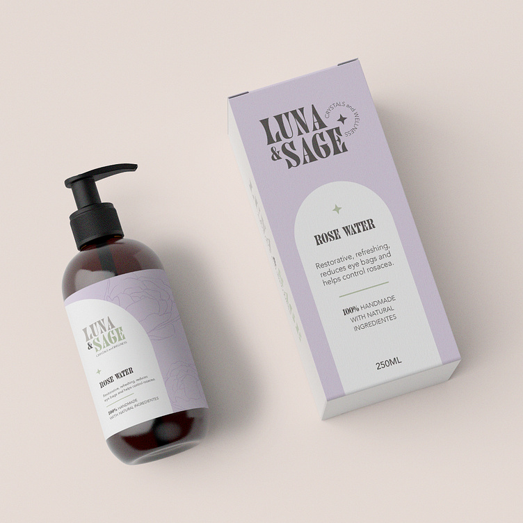
Finally, for the packaging design, I created a minimalist and elegant look that featured the brand logo prominently. The packaging design incorporates the same pastel colors used throughout the branding, with subtle hints of the crystal element.
Overall, I'm thrilled with how this branding project turned out, and I'm confident that it perfectly captures the essence of the client's brand. I can't wait to see it in action and help the crystal and well-being shop thrive!