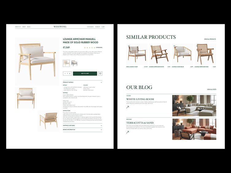
WESTWING | e-commerce redesign concept
Hey everyone! 🤍
Description
Westwing is a Dutch online platform for home and living inspiration and shopping. With a carefully curated selection of furniture, home decor, and lifestyle products. Westwing offers its customers a unique and stylish shopping experience.
Challenge
A redesign of Westwing website to improve its content quality, browsing experience, and overall information architecture. Meanwhile, set the tone for the brand's value and the site's offering.
Goal
The goal of the project is to increase the traffic volume along with improving credibility and ease of use which will impact on product sales and thus generate more revenue for the company.
What do you think of this design?
What was done
Research
UX/UI design
Motion
What tools did I use?
Figma
Jitter
Is it possible to view the project in its entirety?
Link to the project on Behance
If you need help with site or landing page design - write to me, I will be happy to help!
Open for cooperation, just send me a message 📩
🔗My social media:
Full page
ALL MATERIALS USE FOR PRESENTATIONAL AND NON-COMMERCIAL PURPOSES ONLY

