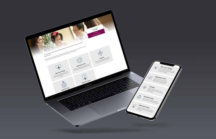
Riley Children's Resources Redesign
This project was completed in 2020 for Riley Children's Health
Problem Statement
User feedback described our resource pages as cluttered and difficult to find the information they needed. The goal was to re-organize the page layouts and to remove unnecessary styling to be more consistent throughout the pages to allow for easy scanning using icons and concise titles.
My Role - UI Designer
Original Design
CTA's and content were distracting with varying photos that obscured the content and inconsistent in style. These elements needed to be unified to group common content together with consistent styling throughout the pages.
Wireframes
With a focus of rearranging the information to group like content together and to align the CTA's to having the same styling I created wireframes designed to be easy to scan.
Visual Design
I created a special set of icons for these resources to create a cleaner look. Riley utilizes a limited color palette, so for these CTA's I used a light gray background with dark blue icons. These designs take up more space on the pages so that there was not significant white space on the right side of the screen to have a more complete look.
Final Product
Riley Children's Health Plan My Visit:
https://www.rileychildrens.org/plan-my-visit
Riley Children's Health Health Professionals:


